css3伪类使用技巧和运用
伪类实现盒子阴影
众所周知,Animate/transition box-shadow 可以使用box-shadow属性来实现盒子阴影效果,但repaint消耗较多,于是这里提出通过修改伪元素的透明度来实现盒子阴影实现原理:通过改变透明度,这样从一个非默认值更新它的值,就不需要承担任何重绘(参见:csstriggers.com/opacity)(ps…
<div class="before">
    <h1>Before</h1>
    <p>Animate/transition box-shadow 可以使用box-shadow属性来实现盒子阴影效果,但重绘消耗较多</p>
</div>
 <hr />
<div class="after">
    <h1>After</h1>
    <p>通过修改伪元素的透明度来实现同样的效果,没有重绘消耗</p>
</div>
.before {
    padding: 1em;
    background-color: #fff;
    -webkit-transition: 0.2s;
    transition: 0.2s;
}
.before:hover {
    box-shadow: 0 0 10px 0 rgba(0, 0, 0, 0.3);
}

.after {
    position: relative;
    padding: 1em;
    background-color: #fff;
}
.after:before {
    content: "";
    position: absolute;
    top: 0;
    right: 0;
    bottom: 0;
    left: 0;
    z-index: -1;
    box-shadow: 0 0 10px 0 rgba(0, 0, 0, 0.3);
    opacity: 0;
    will-change: opacity;
    -webkit-transition: 0.2s;
    transition: 0.2s;
}
.after:hover:before {
    opacity: 1;
}


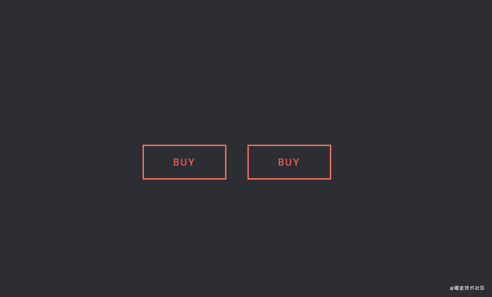
伪元素实现悬停时按钮填充和边界浮动动画
<div class="box one">
    <div class="item">Buy</div>
</div>

<div class="box two">
     <div class="item">Buy</div>
</div>
.box { position: relative; width: 120px; height: 50px; display: flex; justify-content: center; align-items: center; margin: 15px; color: #F27059; } .item { text-transform: uppercase; letter-spacing: 2px; font-size: 14px; z-index: 99; display: flex; justify-content: center; align-items: center; transition: 0.4s all ease; } .one:before, .one:after { position: absolute; content: ''; width: 100%; height: 2px; background: #F27059; transition: 0.4s all ease; } .one:before { top: 0; } .one:after { bottom: 0; } .one .item:before, .one .item:after { position: absolute; top: 0; content: ''; height: 100%; width: 2px; background: #F27059; transition: 0.4s all ease; z-index: -1; } .one .item:before { left: 0; } .one .item:after { right: 0; } .one:hover:before, .one:hover:after { transition: 0.4s all ease; } .one:hover:before { transform: translateY(-10px); } .one:hover:after { transform: translateY(10px); } .one:hover .item { color: white; } .one:hover .item:before, .one:hover .item:after { width: 100%; transition: 0.4s all ease; } .two { box-sizing: border-box; border: 2px solid #F27059; position: relative; } .two:before { position: absolute; content: ''; width: 0; height: 50px; transition: 0.4s all ease; background: #F27059; left: 0; z-index: -1; } .two:hover { color: white; } .two:hover:before { width: 100%; transition: 0.4s all ease; }
伪类after实现的三角箭头
实现原理:三边设置边框,箭头指向的那个方向的border不用设置,位于箭头两边的边框颜色为透明(transparent),对边为主体边框颜色(较大的)/主体背景颜色(较小的),因为我们要有边框颜色的三角箭头,当第一个箭头(较大的)被第二个箭头(较小的)通过准确覆盖之后剩下没被覆盖的边缘就是合成三角箭头的边框了,其颜色就是较大的那个三角箭头的颜色,可调。而较小的那个三角箭头的颜色要设置成主体颜色,进行负值定位偏移时要把主体边框盖住,从而与主体合在一起了
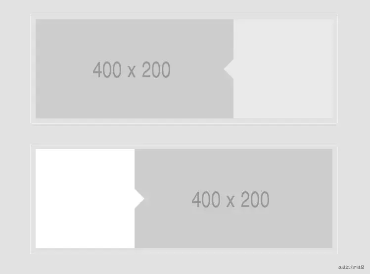
<div class='container'>
     <img alt='' src='http://placehold.it/400x200'>
	 <div class='arrow-left'></div>
</div>
<div class='container new'>
    <div class='arrow-right'></div>
    <img alt='' src='http://placehold.it/400x200'>
</div>
.container {
    margin: 40px auto;
    width: 600px;
    border: 1px solid #eee;
    padding: 10px;
}
.container:after {
    clear: both;
    content: "";
    display: table;
}
.container img {
    float: left;
}
.arrow-left {
    position: relative;
    width: 200px;
    height: 200px;
    background: #E9E9E9;
    float: right;
}
.arrow-left:before {
    z-index: 9999;
    content: "";
    display: block;
    width: 0;
    height: 0;
    border-top: 20px solid transparent;
    border-bottom: 20px solid transparent;
    border-right: 20px solid #E9E9E9;
    position: absolute;
    left: -20px;
    top: 80px;
}
.arrow-right {
    position: relative;
    width: 200px;
    height: 200px;
    background: #fff;
    float: left;
}
.arrow-right img {
    float: right;
}
.arrow-right:after {
    content: "";
    display: block;
    width: 0;
    height: 0;
    border-top: 20px solid transparent;
    border-bottom: 20px solid transparent;
    border-left: 20px solid #fff;
    position: absolute;
    right: -20px;
    top: 80px;
}
伪类after实现的图片箭头
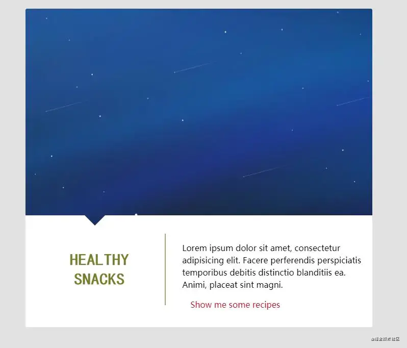
<div class="healthy-snacks">
    <div class="featured-image">
        <img src="img/landing.jpg" alt="Healthy Snacks" />
    <div class="arrow"></div>
</div>
<article>
    <header>
         <h3><span>Healthy</span> <span>Snacks</span></h3>
    </header>
    <div class="excerpt">
        <p>Lorem ipsum dolor sit amet, consectetur adipisicing elit. Facere perferendis perspiciatis temporibus debitis distinctio blanditiis ea. Animi, placeat sint magni.</p>
         <a href="#"><span class="fa fa-arrow-circle-right"></span><span>Show me somerecipes</span></a>
    </div>
</article>
</div>
body { background: #E1E1E1; background-size: cover; background-position: 50% 50%; } .healthy-snacks { margin: 2em auto; width: 90%; max-width: 680px; background: #fff; border-top-left-radius: 3px; border-top-right-radius: 3px; border-bottom-left-radius: 3px; border-bottom-right-radius: 3px; -webkit-backface-visibility: hidden; backface-visibility: hidden; } .healthy-snacks .featured-image { position: relative; overflow: hidden; } .healthy-snacks .featured-image img { display: block; width: 100%; height: auto; vertical-align: bottom; border-top-left-radius: 3px; border-top-right-radius: 3px; } .healthy-snacks .featured-image .arrow { position: absolute; bottom: 0; width: 100%; height: 0px; background-color: #fff; } .healthy-snacks .featured-image .arrow:before, .healthy-snacks .featured-image .arrow:after { content: ''; position: absolute; bottom: 100%; width: 80%; height: 20px; background-color: inherit; } .healthy-snacks .featured-image .arrow:before { right: 80%; -webkit-transform-origin: 100% 100%; -moz-transform-origin: 100% 100%; -ms-transform-origin: 100% 100%; -o-transform-origin: 100% 100%; transform-origin: 100% 100%; -webkit-transform: skewX(45deg); -moz-transform: skewX(45deg); -ms-transform: skewX(45deg); -o-transform: skewX(45deg); transform: skewX(45deg); } .healthy-snacks .featured-image .arrow:after { left: 20%; -webkit-transform-origin: 0 100%; -moz-transform-origin: 0 100%; -ms-transform-origin: 0 100%; -o-transform-origin: 0 100%; transform-origin: 0 100%; -webkit-transform: skewX(-45deg); -moz-transform: skewX(-45deg); -ms-transform: skewX(-45deg); -o-transform: skewX(-45deg); transform: skewX(-45deg); } .healthy-snacks article { padding: 1em 1em 2em; } .healthy-snacks article:after { content: ""; display: table; clear: both; } .healthy-snacks article header { border-bottom: 2px solid #9bb068; } .healthy-snacks article header h3 { margin: 0 0 0.25em; font-family: 'McLaren', cursive; font-size: 1.5em; color: #767d2e; text-align: center; text-transform: uppercase; } .healthy-snacks article .excerpt { font-family: 'Open Sans', sans-serif; } .healthy-snacks article .excerpt p { line-height: 24px; } .healthy-snacks article .excerpt a { display: block; margin-top: 1em; color: #c00413; text-decoration: none; } .healthy-snacks article .excerpt a:hover { color: #fb2f40; } .healthy-snacks article .excerpt a span:first-child { padding-right: 1em; vertical-align: middle; } @media only screen and (min-width: 680px) { .healthy-snacks article header { width: 40%; float: left; border-bottom: none; border-right: 2px solid #9bb068; } .healthy-snacks article header h3 { margin: 1em 0; font-size: 2em; } .healthy-snacks article header h3 span { display: block; } .healthy-snacks article .excerpt { width: 60%; float: left; padding-left: 2em; } }
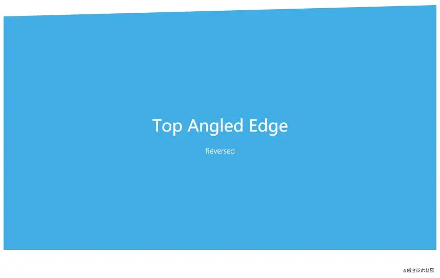
伪元素实现带角度的底部边界(倾斜的边界)
		<div class="block -berry edge--bottom">
		    <h1>Bottom Angled Edge</h1>
		</div>

		<div class="block -blue edge--bottom--reverse">
		    <h1>Bottom Angled Edge</h1>
		    <p>Reversed</p>
		</div>

		<div class="block -berry edge--top">
		    <h1>Top Angled Edge</h1>
		</div>

		<div class="block -blue edge--top--reverse">
		    <h1>Top Angled Edge</h1>
		    <p>Reversed</p>
		</div>

		<div class="block -orange edge--both">
		    <h1>Top & Bottom Angled Edges</h1>
		</div>

		<div class="block -green edge--both--reverse">
		    <h1>Top & Bottom Angled Edges</h1>
		    <p>Reversed</p>
		</div>
.edge--bottom { position: relative; z-index: 1; } .edge--bottom:after { background: inherit; content: ''; display: block; height: 50%; left: 0; position: absolute; right: 0; z-index: -1; } .edge--bottom:after { bottom: 0; -webkit-transform: skewY(-1.5deg); -ms-transform: skewY(-1.5deg); transform: skewY(-1.5deg); -webkit-transform-origin: 100%; -ms-transform-origin: 100%; transform-origin: 100%; } .edge--bottom--reverse { position: relative; z-index: 1; } .edge--bottom--reverse:after { background: inherit; content: ''; display: block; height: 50%; left: 0; position: absolute; right: 0; z-index: -1; } .edge--bottom--reverse:after { bottom: 0; -webkit-transform: skewY(1.5deg); -ms-transform: skewY(1.5deg); transform: skewY(1.5deg); -webkit-transform-origin: 0 100%; -ms-transform-origin: 0 100%; transform-origin: 0 100%; } .edge--top { position: relative; z-index: 1; } .edge--top:before { background: inherit; content: ''; display: block; height: 50%; left: 0; position: absolute; right: 0; z-index: -1; } .edge--top:before { top: 0; -webkit-transform: skewY(1.5deg); -ms-transform: skewY(1.5deg); transform: skewY(1.5deg); -webkit-transform-origin: 100% 0; -ms-transform-origin: 100% 0; transform-origin: 100% 0; } .edge--top--reverse { position: relative; z-index: 1; } .edge--top--reverse:before { background: inherit; content: ''; display: block; height: 50%; left: 0; position: absolute; right: 0; z-index: -1; } .edge--top--reverse:before { top: 0; -webkit-transform: skewY(-1.5deg); -ms-transform: skewY(-1.5deg); transform: skewY(-1.5deg); -webkit-transform-origin: 0 0; -ms-transform-origin: 0 0; transform-origin: 0 0; } .edge--both { position: relative; z-index: 1; } .edge--both:before, .edge--both:after { background: inherit; content: ''; display: block; height: 50%; left: 0; position: absolute; right: 0; z-index: -1; } .edge--both:before { top: 0; -webkit-transform: skewY(1.5deg); -ms-transform: skewY(1.5deg); transform: skewY(1.5deg); -webkit-transform-origin: 100% 0; -ms-transform-origin: 100% 0; transform-origin: 100% 0; } .edge--both:after { bottom: 0; -webkit-transform: skewY(-1.5deg); -ms-transform: skewY(-1.5deg); transform: skewY(-1.5deg); -webkit-transform-origin: 100%; -ms-transform-origin: 100%; transform-origin: 100%; } .edge--both--reverse { position: relative; z-index: 1; } .edge--both--reverse:before, .edge--both--reverse:after { background: inherit; content: ''; display: block; height: 50%; left: 0; position: absolute; right: 0; z-index: -1; } .edge--both--reverse:before { top: 0; -webkit-transform: skewY(-1.5deg); -ms-transform: skewY(-1.5deg); transform: skewY(-1.5deg); -webkit-transform-origin: 0 0; -ms-transform-origin: 0 0; transform-origin: 0 0; } .edge--both--reverse:after { bottom: 0; -webkit-transform: skewY(1.5deg); -ms-transform: skewY(1.5deg); transform: skewY(1.5deg); -webkit-transform-origin: 0 0; -ms-transform-origin: 0 0; transform-origin: 0 0; } .-berry { background: #b52b4a; } .-blue { background: #41ade5; } .-orange { background: #de6628; } .-green { background: #5e9b42; } .block { color: #fff; font-family: 'Fira Sans', sans-serif; margin: 0 0 200px; padding: 20% 20px; text-align: center; } h1 { font-size: 32px; font-weight: 500; } p { font-size: 14px; font-weight: 300; margin-top: 0.5em; }
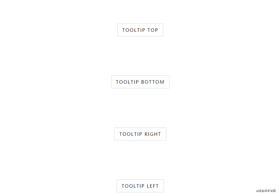
伪元素和平移(translate)变换实现的提示框
<code class="hljs language-<div copyable" lang="<div class="row"> <a rel="nofollow" rel="noreferrer" href="#" class="btn tooltip top"> <span>TOOLTIP TOP</span> <span class="tooltip-content">Lorem ipsum dolor sit amet</span> </a> </div> <div class="row"> <a rel="nofollow" rel="noreferrer" href="#" class="btn tooltip bottom"> <span>TOOLTIP BOTTOM</span> <span class="tooltip-content">Lorem ipsum dolor sit amet</span> </a> </div> <div class="row"> <a rel="nofollow" rel="noreferrer" href="#" class="btn tooltip right"> <span>TOOLTIP RIGHT</span> <span class="tooltip-content">Lorem ipsum dolor sit amet</span> </a> </div> <div class="row"> <a rel="nofollow" rel="noreferrer" href="#" class="btn tooltip left"> <span>TOOLTIP LEFT</span> <span class="tooltip-content">Lorem ipsum dolor sit amet</span> </a> </div> </div>-webkit-box-align: center; -ms-flex-align: center; align-items: center; box-sizing: border-box; display: -webkit-box; display: -ms-flexbox; display: flex; -webkit-box-orient: vertical; -webkit-box-direction: normal; -ms-flex-direction: column; flex-direction: column; height: 100vh; font-family: 'Fira Sans', sans-serif; -webkit-box-pack: center; -ms-flex-pack: center; justify-content: center; padding: 2rem 0; width: 100vw; } .row { display: -webkit-box; display: -ms-flexbox; display: flex; margin: auto; } a { text-decoration: none; } .btn { margin: 0 .5em; } /* COLORS */ /* BUTTONS */ .btn { -webkit-box-align: center; -ms-flex-align: center; align-items: center; background-color: white; border: 1px solid #cdd2d6; box-sizing: border-box; color: #000000; display: -webkit-box; display: -ms-flexbox; display: flex; height: 45px; letter-spacing: 2px; padding: .8em 1em; -webkit-transition: all .3s ease; transition: all .3s ease; } .btn:hover { background-color: #05a8ff; border-color: #05a8ff; color: #ffffff; } /* TOOLTIP */ .tooltip { position: relative; overflow: hidden; } .tooltip:hover { overflow: visible; } .tooltip:hover .tooltip-content { opacity: 1; } .tooltip .tooltip-content { background: #05a8ff; box-shadow: 0 5px 25px 5px rgba(205, 210, 214, 0.8); box-sizing: border-box; color: #ffffff; font-size: 12px; line-height: 1.2; letter-spacing: 1px; max-width: 200px; min-width: 145px; padding: 1em; position: absolute; opacity: 0; -webkit-transition: all .3s ease; transition: all .3s ease; } .tooltip .tooltip-content::after { background: #05a8ff; content: ""; height: 10px; position: absolute; -webkit-transform: rotate(45deg); transform: rotate(45deg); width: 10px; } .tooltip.top .tooltip-content { bottom: calc(100% + 1.5em); left: 50%; -webkit-transform: translateX(-50%); transform: translateX(-50%); } .tooltip.top .tooltip-content::after { bottom: -5px; left: 50%; margin-left: -5px; } .tooltip.bottom .tooltip-content { bottom: calc(-100% - 1.8em); left: 50%; -webkit-transform: translateX(-50%); transform: translateX(-50%); } .tooltip.bottom .tooltip-content::after { top: -5px; } .tooltip.right .tooltip-content { left: calc(100% + 1.5em); top: 50%; -webkit-transform: translateY(-50%); transform: translateY(-50%); } .tooltip.right .tooltip-content::after { left: -5px; margin-top: -5px; top: 50%; } .tooltip.left .tooltip-content { right: calc(100% + 1.5em); top: 50%; -webkit-transform: translateY(-50%); transform: translateY(-50%); } .tooltip.left .tooltip-content::after { right: -5px; margin-top: -5px; top: 50%; }
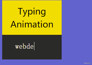
使用CSS3伪元素实现的自动打字动画
原理:Typing Animation with Pseudo-Elements 看起来是打字,其实是使用伪元素覆盖在字符串上,然后逐渐减少伪元素覆盖宽度来实现的视觉效果
<code class="hljs language-copyable" lang=""> <h1>Typing Animation</h1> <p class="tagline"> <span class="tagline-skill"><span class="tagline-skill_inner">webdesign</span></span> </p> </div>content: ""; position: absolute; top: -1px; right: 0; bottom: -2px; left: 0; border-left: 1px solid #fff; background-color: #2a2a28; -webkit-animation: animatetoright 1s steps(10) infinite alternate; animation: animatetoright 1s steps(10) infinite alternate; }
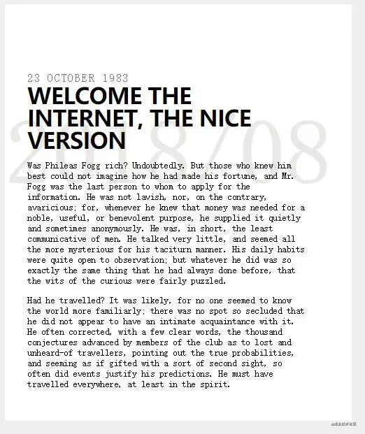
CSS3 伪元素构建的文章水印背景
<code class="hljs language-<div copyable" lang="<div class="pre-headline">23 October 1983</div> <h1>Welcome The Internet, The Nice Version</h1> <p>Was Phileas Fogg rich? Undoubtedly. But those who knew him best could not imagine how he had made his fortune, and Mr. Fogg was the last person to whom to apply for the information. He was not lavish, nor, on the contrary, avaricious; for, whenever he knew that money was needed for a noble, useful, or benevolent purpose, he supplied it quietly and sometimes anonymously. He was, in short, the least communicative of men. He talked very little, and seemed all the more mysterious for his taciturn manner. His daily habits were quite open to observation; but whatever he did was so exactly the same thing that he had always done before, that the wits of the curious were fairly puzzled.</p> <p>Had he travelled? It was likely, for no one seemed to know the world more familiarly; there was no spot so secluded that he did not appear to have an intimate acquaintance with it. He often corrected, with a few clear words, the thousand conjectures advanced by members of the club as to lost and unheard-of travellers, pointing out the true probabilities, and seeming as if gifted with a sort of second sight, so often did events justify his predictions. He must have travelled everywhere, at least in the spirit.</p> </div>width: 400px; padding: 6rem 4rem 2rem 2rem; background: #fff; margin: 0.5rem; } .pre-headline { color: #777; letter-spacing: 0.1rem; font-family: monospace; font-size: 1.25rem; text-transform: uppercase; } h1 { position: relative; margin: 0; font-weight: bold; letter-spacing: -0.05rem; line-height: 1; text-transform: uppercase; z-index: 10; } h1:before { content: "2018/08"; font-family: monospace; font-size: 10rem; position: absolute; top: 2rem; left: -2rem; z-index: 0; line-height: 1; color: rgba(50, 25, 0, 0.1); }
最后:伪类兼容性了解一下
1、IE8不支持CSS3中很多特性,比如伪元素nth-child,可以使用+号(代表相邻元素)来实现相同功能
2、Google的IE9.js是解决IE5.5到IE8 CSS3特性兼容性问题的JS库