
Antd源码浅析(一)Icon组件
前言
最近在写B端的项目,用到了Ant Design,清爽而优雅。故想深入源码了解一二,但鉴于技术浅薄,不敢深究,故写浅析,不喜勿喷,对其中的组件做一些分析,主要目的有两个:
- 学习Ant Design的工程设计思路
- 思考怎样写出优秀的React组件
本文是基于Ant Design3.4.4的源码分析,读者需要具备基本的JavaScript、React知识,对于Antd(以下用Antd表示Ant Design),蚂蚁官网给出的定位是”一个服务于企业级产品的设计体系”,确实,我们的实际使用场景,大多是写一些后台页面,如CMS。当下的Antd比之React,就像Bootstrap比之jQuery,同样Vue也不乏有Element UI之类的搭档。
Antd源码是基于Typescript(系出微软,是 JavaScript 的一个类型超集,包含它自己的编译器,是一种类型化语言),如果有阅读过Vue源码的的同学肯定也会发现,Vue中使用了Flow来做同样的事,即静态类型检查。JavaScript是弱类型语言,很多大型库都加入了Flow或者Typescript,严谨为之。
目录结构
打开Antd源码目录,结构还是比较简洁:
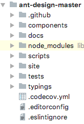

平时所用到的组件全部位于 components 文件夹下,首先我们分析一个简单的组件Icon,打开 components/icon ,目录结构如下:
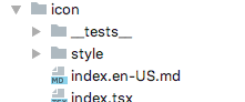
这里不得不说Antd的文档是很友好的,目录内的以 .md 结尾的文件给出了中英文的使用说明,也就是我们在在其官网看到的说明文档。
代码
Icon的核心代码位于 index.tsx 内,这里说明一下,对于不熟悉Typescript的同学来说这个文件类型可能有些陌生,Typescript主要是丰富了JavaScript的内容和加入了静态类型检查,一般的Typescript文件是以 .ts 结尾,但相对于React的jsx文件,Typescript产生了 .tsx 的文件,其实就是Typescript的jsx写法,实际生产环境中,最终都要编译成 .js 文件。
以下是Icon组件中 index.tsx 的全部源码:
import * as React from 'react';
import classNames from 'classnames';
import omit from 'omit.js';

export interface IconProps {
  type: string;
  className?: string;
  title?: string;
  onClick?: React.MouseEventHandler<any>;
  spin?: boolean;
  style?: React.CSSProperties;
}

const Icon = (props: IconProps) => {
  const { type, className = '', spin } = props;
  const classString = classNames({
    anticon: true,
    'anticon-spin': !!spin || type === 'loading',
    [`anticon-${type}`]: true,
  }, className);
  return <i {...omit(props, ['type', 'spin'])} className={classString} />;
};

export default Icon;
我们看看官网使用示例和API描述:
<Icon type="question" style={{ fontSize: 16, color: '#08c' }} />|
参数 |
说明 |
类型 |
默认值 |
|---|---|---|---|
|
spin |
是否有旋转动画 |
boolean |
false |
|
style |
设置图标的样式,例如 fontSize 和 color |
object |
- |
|
type |
图标类型 |
string |
- |
首先导入的是3个依赖
import * as React from 'react';
import classNames from 'classnames';
import omit from 'omit.js';大家对React比较熟悉,对于classnames和omit.js,这里做些说明。
classNames基本使用方法
classnames主要是为组件提供动态css功能,方便向React之类的应用提供状态编程
var classNames = require('classnames');
classNames('foo', 'bar'); // => 'foo bar'

classNames('foo', { bar: true }); // => 'foo bar'
classNames({ 'foo-bar': true }); // => 'foo-bar'
classNames({ 'foo-bar': false }); // => ''
classNames({ foo: true }, { bar: true }); // => 'foo bar'
classNames({ foo: true, bar: true }); // => 'foo bar'

// 不同的参数类型
classNames('foo', { bar: true, duck: false }, 'baz', { quux: true }); // => 'foo bar baz quux'

// 忽略错误的数据类型
classNames(null, false, 'bar', undefined, 0, 1, { baz: null }, ''); // => 'bar 1'

// 数组参数
var arr = ['b', { c: true, d: false }];
classNames('a', arr); // => 'a b c'
classnames能够很简便的处理css的class开关,类似于在jsx中
{ true? 'class-a': 'class-b' }但是要优雅和方便很多,结合ES2015中的字符串变量,就可以玩的更开心
let buttonType = 'primary';
classNames({ [`btn-${buttonType}`]: true });
当然怎么能少了直接使用React
var classNames = require('classnames');

var Button = React.createClass({
  // ...
  render () {
    var btnClass = classNames({
      btn: true,
      'btn-pressed': this.state.isPressed,
      'btn-over': !this.state.isPressed && this.state.isHovered
    });
    return <button className={btnClass}>{this.props.label}</button>;
  }
});
omit.js基本使用方法
omit.js,作用就是过滤掉对象中不需要的属性,避免把不必要的属性传递下去
var omit = require('omit.js');
omit({ name: 'Benjy', age: 18 }, [ 'name' ]); // => { age: 18 }
这个库的源码很简单,直接贴出:
function omit(obj, fields) {
  const shallowCopy = {
    ...obj,
  };
  for (let i = 0; i < fields.length; i++) {
    const key = fields[i];
    delete shallowCopy[key];
  }
  return shallowCopy;
}

export default omit;
属性校验
接下来我们看看 IconProps , IconProps 是Icon组件的参数验证器,作用和React中的 PropTypes 相同,确保你接收到的数据是有效的,能够在识别些某些类型问题,所以React官方也建议,对于更大的代码库使用Flow或者TypeScript来替代 PropTypes ,Antd的开发使用了TypeScript。
export interface IconProps {
  type: string;    // 图标类型必须为string
  className?: string;   // className类型必须为string
  title?: string;   // title类型必须为string
  onClick?: React.MouseEventHandler<any>;    // onClick类型必须为React.MouseEventHandler
  spin?: boolean;    // 是否有旋转动画类型必须为boolean
  style?: React.CSSProperties;  // style类型必须为React.CSSProperties
}
在这里 ? 代表参数可选,对于 React.MouseEventHandler<any> 和 React.CSSProperties 是TypeScript为React定义的数据类型, <> 为泛型标识,我们不妨以 React.MouseEventHandler<any> 为例子深入看一下TypeScript实现的事件类型定义,如果不理解,可以简单理解为一种数据类型。
// 第一层
React.MouseEventHandler<any>

// 第二层
type MouseEventHandler<T> = EventHandler<MouseEvent<T>>;

// 第三层
interface MouseEvent<T> extends SyntheticEvent<T> {
    altKey: boolean;
    button: number;
    buttons: number;
    clientX: number;
    clientY: number;
    ctrlKey: boolean;
    /**
     * See [DOM Level 3 Events spec](https://www.w3.org/TR/uievents-key/#keys-modifier). for a list of valid (case-sensitive) arguments to this method.
     */
    getModifierState(key: string): boolean;
    metaKey: boolean;
    nativeEvent: NativeMouseEvent;
    pageX: number;
    pageY: number;
    relatedTarget: EventTarget;
    screenX: number;
    screenY: number;
    shiftKey: boolean;
}


// 第四层
// Event System
// ----------------------------------------------------------------------

interface SyntheticEvent<T> {
    bubbles: boolean;
    /**
     * A reference to the element on which the event listener is registered.
     */
    currentTarget: EventTarget & T;
    cancelable: boolean;
    defaultPrevented: boolean;
    eventPhase: number;
    isTrusted: boolean;
    nativeEvent: Event;
    preventDefault(): void;
    isDefaultPrevented(): boolean;
    stopPropagation(): void;
    isPropagationStopped(): boolean;
    persist(): void;
    // If you thought this should be `EventTarget & T`, see https://github.com/DefinitelyTyped/DefinitelyTyped/pull/12239
    /**
     * A reference to the element from which the event was originally dispatched.
     * This might be a child element to the element on which the event listener is registered.
     *
     * @see currentTarget
     */
    target: EventTarget;
    timeStamp: number;
    type: string;
}以上是React类型定义的源码,小伙伴们是不是能够理解一些了,如果我们用React本身实现Icon的验证,有如下写法:
import PropTypes from 'prop-types';

Icon.propTypes = {
  type: PropTypes.string;
  className: PropTypes.string;
  title: PropTypes.string;
  onClick: PropTypes.func;
  spin: PropTypes.bool;
  style: PropTypes.object;
};
主体代码
const Icon = (props: IconProps) => {
  const { type, className = '', spin } = props;
  const classString = classNames({
    anticon: true,
    'anticon-spin': !!spin || type === 'loading',
    [`anticon-${type}`]: true,
  }, className);
  return <i {...omit(props, ['type', 'spin'])} className={classString} />;
};
可以看到Antd使用 <i> 标签来实现Icon组件,首先通过 IconProps 校验参数,然后组合 className ,默认添加 anticon ,判断 spin 属性,选择是否添加 anticon-spin ,接着添加 anticon-${type}属性,生成 className ,通过 omit 过滤掉 type , spin 属性,因为这俩属性对于 <i> 标签是没有意义的,为了理解我们举个实际使用例子。
<Icon type="question" style={{ fontSize: 16 }} />生成的HTML中的代码如下:
<i class="anticon anticon-question" style="font-size: 16px;"></i>总结
到这里对于Icon组件,我们就能直观的看到其实现原理了,可能部分读者对于TypeScript这块有些疑虑,可以简单理解为数据类型校验,这里我们能够学习到:
- Antd组件实现的基本结构和思路
- 组件对于参数的校验的方式
- 优雅的处理
classNames - 省略一些不必要的参数