
由于最近项目图表非常多,而且很多都是有共性的,于是摸索除了一套便于管理的图表配置方式。
一种是处理共性的,可参考下方的1,2,3,4
一种是处理特殊性的,可参考下方的5
1. 基本样式模块化
把一些常用的属性一块一块写好。下面举一些例子
| 名称 | 示例 |
|---|---|
| 提示样式 |   |
| label样式 |  |
| 常见legend |  |
import * as echarts from 'echarts';
// 配置要用到的颜色组
// 这里推荐一个vscode插件:color hightlight,可以直接将颜色字符串转为对应的颜色作为该字符串的背景色
// 还有一个颜色选择器网站:https://www.w3schools.cn/colors/colors_picker.asp
const colorGroup = [
['rgba(255, 208, 0, 1)', 'rgba(255, 208, 0, 0.4)'],
['rgba(25,163,223,1)', 'rgba(25,163,223,.4)'],
['rgba(59, 255, 137, 1)', 'rgba(59, 255, 137, 0.4)'],
['rgba(0, 255, 247, 1)', 'rgba(0, 255, 247, 0.4)'],
['rgba(0, 205, 132, 1)', 'rgba(0, 205, 132, 0.4)'],
['#bfd214', '#6699ff'],
['#99da69', '#01babc'],
['#5ff6e9', '#7370fd'],
['#f5b159', '#f4d66c'],
['#695af2', '#92f6be'],
['#b9f692', '#f4d66c'],
['rgba(0,244,255,1)', 'rgba(0,77,167,1)'],
['rgba(230, 230, 0, 1)', 'rgba(230, 230, 0, 0.4)'],
['rgba(255, 77, 77, 1)', 'rgba(255, 77, 77, 0.5)'],
['rgba(  255, 255, 102, 1)', 'rgba(  255, 255, 102, 0.5)'],
];
// 自定义提示框样式
const getTooltip=(title,unit)=>({
trigger: 'axis',
axisPointer: {
type: 'cross',
label: {
backgroundColor: '#6a7985'
}
},
formatter: (params)=>{
return `<div style="width:200px">
<div>${params[0].name}</div>
<div style="display:flex;justify-content:space-between;align-items:center;height:10px">
<div style="height:100%;display:flex;align-items:center;">
<div style="width:10px;height:10px;border-radius:5px;background:${params[0].color};margin-right:4px"></div>
<div>${title}</div>
</div>
<div>${params[0].value}${unit}</div>
</div>
</div>`
}
})
// 图表标题样式
const TitleStyle = {
left: 'center',
textStyle: {
color: '#09d9b9',
fontWeight: 'bold',
fontSize: '18px'
}
};
// 横轴滑块
const DataZoom=(length,max=5)=>({
top: "92%",
id: 'dataZoomX',
type: 'slider',
xAxisIndex: [0],
filterMode: 'filter',
zoomLock: true,
height: 16,
brushSelect: false,
show: length>max,  // 当数据条数大于5时显示
maxValueSpan:max   // 当前窗口允许显示的数据条数
})
// 横轴基本样式
const XAxisBaseStyle = {
axisLine: { onZero: false },
splitLine: { show: false },
axisLine: {
show: true,
lineStyle: {
color: '#5e96c7'
}
},
nameTextStyle: {
color: '#9ec2ff',
fontSize: 12
}
};
// 横轴样式(+ 格式化label)
const XAxisStyle = {
...XAxisBaseStyle,
axisLabel: {
textStyle: {
color: '#9ec2ff',
fontSize: 12
},
// 自定义样式,由于横坐标基本都是 2022-12-13 11:10:10 这样的,
// 所以这边单独做了格式化
formatter: function (params) {
let [date, time] = params.split(' ');
return date + '\n' + time;
}
},
};
// 是否应用X轴间隔:每隔几个坐标要隐藏中间的数据。
// (有时候数据多也不像用间隔,所以再加个isApply参数)
const getIntervalXAxis = (isApply,length,max=5) => ({
...XAxisBaseStyle,
axisLabel: {
textStyle: {
color: '#9ec2ff',
fontSize: 12
},
formatter: function (params) {
let [date, time] = params.split(' ');
return date + '\n' + time;
},
...((length > max && isApply)?{interval:Math.floor(length / max)}:{})
}
});
// 图标位置
const GridStyle = {
x: 46,
y: 55,
x2: 40,
y2: 60
};
// 标题样式
const TitleStyle = {
left: 'center',
textStyle: {
color: '#09d9b9',
fontWeight: 'bold',
fontSize: '18px'
}
};
// legend固定样式
const TwoLegendStyle = {
data: ['最高值', '最低值'],
top: '2%',
right:'4%',
textStyle: {
color: '#ffffff'
}
};
// ...
2. 图表series样式模块化
折线: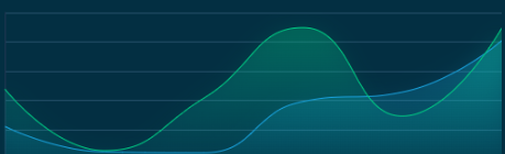
// 折线图样式
const SmoothLine = (firstColor = 'rgba(255, 208, 0, 1)', secondColor = 'rgba(255, 208, 0, 0.4)') => ({
type: 'line',
symbol: 'circle', // 默认是空心圆(中间是白色的),改成实心圆
showAllSymbol: true,
symbolSize: 0,
smooth: true,
lineStyle: {
normal: {
width: 1,
color: firstColor // 线条颜色
},
borderColor: 'rgba(0,0,0,.4)'
},
itemStyle: {
color: firstColor
},
areaStyle: {
//区域填充样式
normal: {
//线性渐变,前4个参数分别是x0,y0,x2,y2(范围0~1);相当于图形包围盒中的百分比。如果最后一个参数是‘true’,则该四个值是绝对像素位置。
color: new echarts.graphic.LinearGradient(
0,
0,
0,
1,
[
{
offset: 0,
color: secondColor
},
{
offset: 1,
color: 'rgba(10,219,250, 0)'
}
],
false
),
shadowColor: secondColor, //阴影颜色
shadowBlur: 20 //shadowBlur设图形阴影的模糊大小。配合shadowColor,shadowOffsetX/Y, 设置图形的阴影效果。
}
}
});
柱体: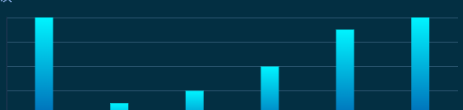
// 柱状图样式
const BarStyle = (firstColor = 'rgba(0,244,255,1)', secondColor = 'rgba(0,77,167,1)') => ({
type: 'bar',
barMaxWidth: 20,
barGap: '10%',
itemStyle: {
normal: {
color: {
type: 'linear',
x: 0,
y: 0,
x2: 0,
y2: 1,
colorStops: [
{
offset: 0,
color: firstColor // 0% 处的颜色
},
{
offset: 1,
color: secondColor // 100% 处的颜色
}
],
global: false // 缺省为 false
}
}
}
});
3. 配置各类图表的options
import ChartStyle from './ChartStyle';  // 把上面配置的所有样式都导进来
// 1. 单折线
// data : 图表数据
// title : 图标标题
// unit : 图标单位
// colors: 颜色组
// isSider: 是否显示滑块
const getLineOps = ({ data = {}, title = '标题', unit = '', colors = ChartStyle.colorGroup[0], isSider = true }) => {
// 根据实际情况处理,建议处理完再传进来,我懒得改了
const timepoints = data.map((item) => item.t).reverse();
const values = data.map((item) => item.v).reverse();
const option = {
tooltip: ChartStyle.getTooltip(title, unit),
grid: ChartStyle.GridStyle,
title: {
text: title,
...ChartStyle.TitleStyle
},
// 如果有滑块要求,再配置滑块属性
dataZoom: isSider ? ChartStyle.DataZoom(timepoints.length) : [],
xAxis: {
type: 'category',
data: timepoints,
boundaryGap: true,
// 如果要滑块,我这边就不应用间隔了
...ChartStyle.getIntervalXAxis(!isSider, timepoints.length)
},
yAxis: {
type: 'value',
name: unit,
...ChartStyle.AxisStyle
},
series: [
{
data: values,
...ChartStyle.SmoothLine(colors[0], colors[1])
}
]
};
return option;
};
// 2. 双折线
const getTwoLinesOps = ({ data = [tops, lows], title = '标题', unit = '', colors = [ChartStyle.colorGroup[1], ChartStyle.colorGroup[2]], isSider = true }) => {
const timepoints = data[0].map((item) => item.t).reverse();
const top_values = data[0].map((item) => item.v).reverse();
const low_values = data[1].map((item) => item.v).reverse();
const option = {
tooltip: ChartStyle.Tooltip,
grid: ChartStyle.GridStyle,
legend: ChartStyle.TwoLegendStyle,
title: {
text: title,
...ChartStyle.TitleStyle
},
dataZoom: isSider ? ChartStyle.DataZoom(timepoints.length) : [],
xAxis: {
type: 'category',
data: timepoints,
boundaryGap: false,
...ChartStyle.getIntervalXAxis(!isSider, timepoints.length)
},
yAxis: {
type: 'value',
name: unit,
...ChartStyle.AxisStyle
},
series: [
{
name: '最高值',
data: top_values,
...ChartStyle.SmoothLine(...colors[0])
},
{
name: '最低值',
stack: 'Total',
data: low_values,
...ChartStyle.SmoothLine(...colors[1])
}
]
};
return option;
};
// 以此类推,可以配置各种图表的options
4. 图表基本属性配置
给各类图表配置一些默认属性
export const Charts = {
water_level: {
name: '水位',
maxTitle: '历史最高水位',
minTitle: '历史最低水位',
unit: 'm',
instance: null,
colors: [colorGroup[1], colorGroup[1], colorGroup[4]], // 颜色组
getOneOps: getLineOps,// 如果是单数据,使用对应的图表options
getTwoOps: getTwoLinesOps// 如果是双数据,使用对应的图表options
},
flow_rate: {
name: '流速',
maxTitle: '历史最大流速',
minTitle: '历史最低流速',
unit: 'm/s',
instance: null,
colors: [colorGroup[2], colorGroup[1], colorGroup[4]],
getOneOps: getLineOps,
getTwoOps: getTwoLinesOps
},
};
如何使用?
// 1. 获取默认配置的属性
// 假设有个图表叫water_level
const key='water_level'
const Chart = Charts[key]  // 获取默认属性
// 2. 传入图表数据,获取图表options
// 当有多个图表都要遍历渲染,或者这个图表有多种展现形式,那么用这种bind的形式就非常不错
// 下面用的是getOneOps 单数据的情况,还可以根据情况切换其他options,比如配置的getTwoOps
// 假设data是该图表获取到的数据,
const getOps = Chart.getOneOps.bind(null, {
data:data.list, // 传入数据
title:data.cn_col, // 图表标题,没有的话可以用默认属性 Chart.name
unit:data.unit,// 图表标题,没有的话可以用默认属性 Chart.unit
colors: Chart.colors[0], // 图表配置的颜色
isSider: false // 是否显示滑块
});
// 3. 获取dom与渲染
if (Chart.instance === null) {
Chart.instance = echarts.init(document.getElementById(key));
}
Chart.instance.setOption(getOps());
// 如何销毁图表?
const key='water_level'
Charts[key].instance.dispose();
Charts[key].instance = null;
对应的图表容器
<div id={key} className="mybox"></div>
5. 图表容器封装
有时候图表要放在一个统一的容器里,或者有些内容也要放在和它们一样的容器里,这时候可以用到高阶组件。假设有个容器样式长这样,那么首先就要设计好这个容器样式,然后只要传入标题和内容/图表就能出效果。

高阶组件封装
import React from 'react';
import * as echarts from 'echarts';
// 包装内容:传入内容组件,再传入一些配置
// chartbox-base类是容器样式
export const wrapContent = (Component, { title = '模块名称', id = 'moduleid' }) => {
class Container extends React.Component {
render() {
return (
<div className="chartbox-base" id={id} key={id}>
<div className="header">
<span className='title'>{title}</span>
</div>
<div className="content">
{
Component && <Component {...this.props} />
}
</div>
</div>
);
}
}
return Container;
};
// 包装图表:传入配置与内容组件,由于内容组件可要可不要,所以挪到了后面
// 这里的配置包含option 也就是图表的option
// 有了这个高阶组件,图表注册和销毁就不用再外层处理了
export const wrapChart = ({id = 'moduleid', title = '模块名称', option={}, minHeight='220px' },Component) => {
class Container extends React.PureComponent {
componentDidMount(){
if (typeof this.chart === 'undefined') {
this.chart = echarts.init(document.getElementById(id));
}
option && this.chart.setOption(option);
}
componentWillUnmount(){
this.chart.dispose();
}
render() {
return (
<div className="chartbox-base" key={id} >
<div className="header">
<span className='title'>{title}</span>
</div>
{
Component
}
<div className="content" id={id} style={{minHeight}}>
</div>
</div>
);
}
}
return Container;
};
方式1:使用父级数据
首先得有一个父界面来放容器呀。假设要放入一个内容,一个图表,它们共用同一个容器:
import BaseInfo from './BaseInfo';
import WaterStats from './WaterStats';
<div>
<BaseInfo/>
<WaterStats data={}/>       // 可传入在父级获取到的一些数据
</div>
内容组件:BaseInfo.js
import React from 'react';
import { wrapContent } from '../utils';  // 导入刚才封装内容的高阶组件
const BaseInfo = () => {
return <div>
放入内容
</div>
};
// 包装了之后,就会多出一个
export default wrapContent(BaseInfo, { title: '农场简介', id: 'baseInfo' });
图表组件:WaterStats.js
import React from 'react';
import { wrapChart,ChartStyle } from '../utils';
// 除了基本的图表,也可以放入额外的内容,这里就发挥到了wrapChart的第二个参数的作用了
const TopInfo = ({data}) => {
return (
<div className='otherinfo'>一些内容 </div>
);
};
const WaterStats = ({data}) => {
const option = {
// 配置图表option
};
//
const DOM = wrapChart({ title: '水文统计', id: 'water_stats', option, minHeight: '160px' }, <TopInfo data={data} />);
return <DOM />;
};
export default WaterStats;
方式2:使用自己的数据
index.js
<BroadcastStats/>
BroadcastStats.js
import React, { useEffect, useState } from 'react';
import { Empty } from 'antd';
import { ChartStyle,wrapContent,wrapChart  } from '../utils';
// 额外的DOM
const TopInfo = ({ total_count, last_mouth_count }) => {
return <div className="otherinfo">
<span>
累计播发<span className="bold">{total_count}</span>次,本月播发 <span className="bold">{last_mouth_count}</span>次
</span>
</div>;
};
// 数据为空时的DOM
const EmptyDom = () => {
return <Empty image={Empty.PRESENTED_IMAGE_SIMPLE} description={<span style={{ color: '#eeeeee' }}>暂无数据</span>} />;
};
// 获取图表options
const getOption = (data) => {
const timepoints = data.map((item) => {
const [year, month, day] = item.month.split('-');
return `${year}-${month}`;
});
const values = data.map((item) => item.count);
const option = {
tooltip: ChartStyle.Tooltip,
legend: {
...ChartStyle.BaseLegendStyle
},
grid: {
left: '3%',
right: '6%',
bottom: '3%',
top: '20%',
containLabel: true
},
xAxis: [
{
type: 'category',
data: timepoints,
axisLabel: {
interval: 0,
rotate: 35
},
axisTick: false,
...ChartStyle.XAxisBaseStyle
}
],
yAxis: [
{
type: 'value',
name: '播发次数',
...ChartStyle.AxisStyle
}
],
series: [
{
data: values,
...ChartStyle.BarStyle('rgba(25,163,223,1)', 'rgba(25,163,223,.4)')
}
]
};
return option;
};
const BroadcastStats = () => {
const [stats, setStats] = useState({
list: [],
total_count: 0,
last_mouth_count: 0
});
const getStats = () => {
// 调用接口获取数据...
setStats({
list: data.list,
total_count: data.total_count,
last_mouth_count: data.last_mouth_count
});
};
useEffect(() => {
getStats();
}, []);
// 根据是否有数据渲染不同DOM
const DOM =
stats.list.length !== 0
? wrapChart({ title: '广播统计', id: 'broadcast_stats', option: getOption(stats.list), minHeight: '160px' }, <TopInfo total_count={stats.total_count} last_mouth_count={stats.last_mouth_count}/>)
: wrapContent(EmptyDom, { title: '广播统计', id: 'broadcast_stats' });
return <DOM />;
};
export default BroadcastStats;
原文链接:https://juejin.cn/post/7217731723508744253 作者:sanhuamao