
前言
前端在等设计的时间真得有点难顶,闲了快半个月了,疯狂找事做!
分析一下🤪
实现一个时钟,本来就是想要实现比较细节的过渡效果,立马想起电子时钟的显示模型。就用像计算器那样的数字展示效果啦~
拆分一下🤪
-
电子时钟的时间,格式大概是
HH:mm:ss -
每个位置的底色是
8,分为七个边,然后显示不同数字的时候,亮不同边的组合。 -
先拼一个带底色的
8,每一个小边都独立,就需要七个边哇。

-
然后旋转跳跃,开始就位。

-
接着拼一下每个数字的展示数据,每一个数字都记一下亮灯的位置,
1代表该位置亮灯了,0代表熄灭。const numList = [ [1,1,1,0,1,1,1], //0 [0,0,1,0,0,1,0], //1 [1,0,1,1,1,0,1], //2 [1,0,1,1,0,1,1], //3 [0,1,1,1,0,1,0], //4 [1,1,0,1,0,1,1], //5 [1,1,0,1,1,1,1], //6 [1,0,1,0,0,1,0], //7 [1,1,1,1,1,1,1], //8 [1,1,1,1,0,1,1], //9 ] -
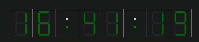
然后定时器获取一下各个位置的实时数字 ,然后再用 Vue 列表渲染就搞定啦,(底色有点太淡了)效果如下~
- 最后再搞一个整点报时吧,当分秒都为0时,提醒我就快可以开溜了~
完全体🤪
<!DOCTYPE html>
<html lang="en">
<head>
<meta charset="UTF-8">
<meta http-equiv="X-UA-Compatible" content="IE=edge">
<meta name="viewport" content="width=device-width, initial-scale=1.0">
<title>Clock</title>
<link rel="stylesheet" href="style.css">
<link rel="shortcut icon" href="favicon.ico" type="image/x-icon">
</head>
<body>
<div id="app">
<div class="clock-cover">
<div class="num-builder">
<div class="num-line" :class="Boolean(v)?'fill':''" v-for="(v, k) in numList[firstHour]" :key="k"></div>
</div>
<div class="num-builder">
<div class="num-line" :class="Boolean(v)?'fill':''" v-for="(v, k) in numList[lastHour]" :key="k"></div>
</div>
<div class="dots num-builder">
<div class="dot"></div>
<div class="dot delay"></div>
</div>
<div class="num-builder">
<div class="num-line" :class="Boolean(v)?'fill':''" v-for="(v, k) in numList[firstMinute]" :key="k"></div>
</div>
<div class="num-builder">
<div class="num-line" :class="Boolean(v)?'fill':''" v-for="(v, k) in numList[lastMinute]" :key="k"></div>
</div>
<div class="dots num-builder">
<div class="dot"></div>
<div class="dot delay"></div>
</div>
<div class="num-builder">
<div class="num-line" :class="Boolean(v)?'fill':''" v-for="(v, k) in numList[firstSecond]" :key="k"></div>
</div>
<div class="num-builder">
<div class="num-line" :class="Boolean(v)?'fill':''" v-for="(v, k) in numList[lastSecond]" :key="k"></div>
</div>
</div>
<div class="message" :class="shark?'shark':''">{{message}}</div>
</div>
<script src="https://cdn.jsdelivr.net/npm/vue@2.6.14/dist/vue.min.js"></script>
<script>
 const numList = [
   [1,1,1,0,1,1,1], //0
   [0,0,1,0,0,1,0], //1
   [1,0,1,1,1,0,1], //2
   [1,0,1,1,0,1,1], //3
   [0,1,1,1,0,1,0], //4
   [1,1,0,1,0,1,1], //5
   [1,1,0,1,1,1,1], //6
   [1,0,1,0,0,1,0], //7
   [1,1,1,1,1,1,1], //8
   [1,1,1,1,0,1,1], //9
 ]
new Vue({
el: '#app',
data() {
return {
message: 'SHARK',
shark: false,
timer: null,
numList,
firstHour: 0,
lastHour: 0,
firstMinute: 0,
lastMinute: 0,
firstSecond: 0,
lastSecond: 0,
}
},
created() {
this.loop()
},
beforeUnmount() {
if(this.timer) {
clearInterval(this.timer)
}
},
methods: {
//更新时间
refresh() {
const date = new Date()
const hour = date.getHours()
const minute = date.getMinutes()
const second = date.getSeconds()
this.firstHour = hour < 10 ? 0 : Math.floor(hour / 10)
this.lastHour = hour < 10 ? hour : hour % 10
this.firstMinute = minute < 10 ? 0 : Math.floor(minute / 10)
this.lastMinute = minute < 10 ? minute : minute % 10
this.firstSecond = second < 10 ? 0 : Math.floor(second / 10)
this.lastSecond = second < 10 ? second : second % 10
// 整点报时
const realTime = !this.firstMinute && !this.lastMinute && !this.firstSecond && !this.lastSecond
if(realTime) {
this.message = '整点报时: ' + date.toLocaleTimeString()
this.shark = true
setTimeout(() => {
this.shark = false
}, 10000)
}
this.message = this.message.toUpperCase()
},
loop() {
this.timer = setInterval(() => {
this.refresh()
}, 1000)
}
}
})
</script>
</body>
</html>
:root{
--default-color: #eee;
--border-default-color: #333;
--active-color: green;
}
body{
margin: 0;
padding: 0;
}
#app{
min-height: 100vh;
max-width: 100vw;
}
.clock-cover{
margin-top: 200px;
box-sizing: border-box;
display: flex;
justify-content: center;
align-items: center;
transform: scale(1);
}
.num-builder{
width: 80px;
height: 100px;
border: 1px solid var(--border-default-color);
display: flex;
flex-direction: column;
align-items: center;
box-sizing: border-box;
}
.num-builder:not(:last-child){
border-right: none;
}
.dots{
padding: 20px 0;
justify-content: space-around;
border-right: none;
}
.dot{
width: 8px;
height: 8px;
background-color: var(--default-color);
animation-name: beat;
animation-duration: 1s;
animation-timing-function: linear;
animation-iteration-count: infinite;
}
.delay{
animation-delay: 0.2s;
}
@keyframes beat {
from{
background: var(--default-color);
}
to{
background: var(--active-color);
}
}
.num-line{
width: 35px;
height: 6px;
border-radius: 10px;
background-color: var(--default-color);
transition: background-color 0.2s linear;
}
.fill{
background-color: var(--active-color);
}
.num-line:nth-of-type(1){
transform: translateY(6px);
}
.num-line:nth-of-type(2){
transform-origin: left center;
transform: translateY(3px) rotate(90deg);
}
.num-line:nth-of-type(3){
transform-origin: right center;
transform: translateY(-3px) rotate(-90deg);
}
.num-line:nth-of-type(4){
transform: translateY(29px);
}
.num-line:nth-of-type(5){
transform-origin: left center;
transform: translateY(26px) rotate(90deg);
}
.num-line:nth-of-type(6){
transform-origin: right center;
transform: translateY(20px) rotate(-90deg);
}
.num-line:nth-of-type(7){
transform: translateY(52px);
}
.message{
width: 20%;
margin: 30px auto 0;
padding: 10px 0;
font-size: 24px;
text-align: center;
color: rgba(37, 89, 20, 0.1);
letter-spacing: 2px;
font-weight: bold;
border: none;
opacity: 0.1;
transition: all 0.5s ease-in;
}
.shark{
opacity: 1;
border: 1px solid var(--border-default-color);
animation: sharking 0.5s ease-in-out infinite;
}
@keyframes sharking {
0%, 100% {
color: green;
transform: rotate(0);
}
25%, 75% {
transform: rotate(10deg);
}
50%{
transform: rotate(-10deg);
}
}
后记
其实还是想实现那种翻页的时钟数字变化效果,后面有时间再发哇~ 🤪🤪
原文链接:https://juejin.cn/post/7239987990160195639 作者:尔尔y