
事情的起因也是偶然在群里看到有人问如何使用CSS实现一个图片锯齿状裂开然后往两边倒的动画效果,也就是下面描述的效果

想了一下,感觉也不难,就尝试一下实现这个效果,主要思路还是 伪元素+clip-path+animation,这是最后实现的效果,codepen预览

实现思路
设置左右半边
首先是实现一左一右两个半边,使用伪元素+clip-path来实现
&:after,
&:before {
	content: "🙂";
	font-size: 200px;
	display: flex;
	justify-content: center;
	position: absolute;
	inset: 0;
	transform-origin: bottom center;
}

&:after {
	clip-path: polygon(0 0, 50% 0, 50% 100%, 0% 100%);
}
&:before {
	clip-path: polygon(50% 0, 50% 100%, 100% 100%, 100% 0);
}

增加裂纹
然后修改clip-path来设置左右半边的裂纹,需要注意的是左右裂纹必须吻合,所以可以考虑提取成css变量公用
--crack: 40% 10%, 60% 20%, 30% 30%, 65% 40%, 40% 50%, 60% 70%, 40% 70%, 60% 80%,
	40% 90%;

&:after,
&:before {
	content: "🙂";
	font-size: 200px;
	display: flex;
	justify-content: center;
	position: absolute;
	inset: 0;
	transform-origin: bottom center;
}

&:after {
	clip-path: polygon(0 0, 50% 0, var(--crack), 50% 100%, 0% 100%);
}
&:before {
	clip-path: polygon(50% 0, var(--crack), 50% 100%, 100% 100%, 100% 0);
}
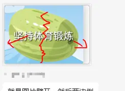
将裂纹位置的变量插入合适的位置即可实现完全一致的裂纹边缘,下图中已经可以隐约看见表情中的裂纹

设置裂开动画
为左右半边设置动画,动画的原点都为底部中间,但是左右旋转方向不同,旋转方向一开始设置的90deg,但是实际效果发现90度在动画完成后锯齿边会凸出来,所以要设置为比90大的角度。
需要设置animation-fill-mode: forwards来保证动画完成后图片保持状态,否则完成后会恢复第一帧的状态
&:after {
	clip-path: polygon(0 0, 50% 0, var(--crack), 50% 100%, 0% 100%);
	animation: rotate-left 2s linear;
	animation-delay: 1s;
	animation-fill-mode: forwards;
}
&:before {
	clip-path: polygon(50% 0, var(--crack), 50% 100%, 100% 100%, 100% 0);
	animation: rotate-right 2s linear;
	animation-delay: 1s;
	animation-fill-mode: forwards;
}

@keyframes rotate-left {
	from {
		transform: rotate(0deg);
	}
	to {
		transform: rotate(-110deg);
	}
}

@keyframes rotate-right {
	from {
		transform: rotate(0deg);
	}
	to {
		transform: rotate(110deg);
	}
}
完整代码
div {
	position: relative;
	width: 200px;
	height: 200px;
	border: 1px solid;
	overflow: hidden;

	--crack: 40% 10%, 60% 20%, 30% 30%, 65% 40%, 40% 50%, 60% 70%, 40% 70%, 60% 80%,
		40% 90%;

	&:after,
	&:before {
		content: "🙂";
		font-size: 200px;
		display: flex;
		justify-content: center;
		position: absolute;
		inset: 0;
		transform-origin: bottom center;
	}

	&:after {
		clip-path: polygon(0 0, 50% 0, var(--crack), 50% 100%, 0% 100%);
		animation: rotate-left 2s linear;
		animation-delay: 1s;
		animation-fill-mode: forwards;
	}
	&:before {
		clip-path: polygon(50% 0, var(--crack), 50% 100%, 100% 100%, 100% 0);
		animation: rotate-right 2s linear;
		animation-delay: 1s;
		animation-fill-mode: forwards;
	}
}

@keyframes rotate-left {
	from {
		transform: rotate(0deg);
	}
	to {
		transform: rotate(-110deg);
	}
}

@keyframes rotate-right {
	from {
		transform: rotate(0deg);
	}
	to {
		transform: rotate(110deg);
	}
}
原文链接:https://juejin.cn/post/7312727134296326178 作者:chansee97