


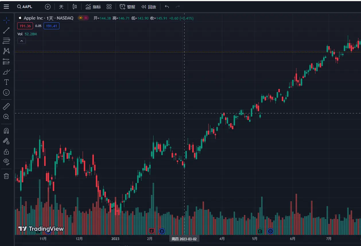
上文示例是 ECharts 官网的示例 K 线图,在我们平常金融图表的开发中一般不会使用 ECharts,我们会更偏向更专业的金融图表库 TradingView。
但为了带领大家快速实现 K 线图,我们将用 Canvas 来实现一个 ECharts 基础示例。该图表的核心难点在于区域动态渲染和交互逻辑。
为避免信息传递误差,在绘制之前我们得先来聊一聊 K 线图中相关的概念。
了解 K 线图
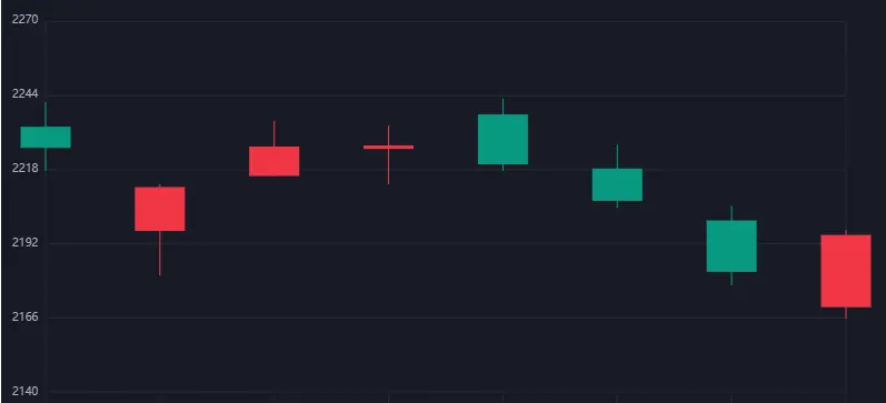
K 线图是一种用于展示金融市场价格走势的图表形式,常用于股票、期货、外汇等市场的技术分析。它由一根根垂直的线段和横向的矩形构成,如下图所示:

K 线图中的每根 K 线代表一段时间内的价格走势,通常是一天或一周。每根 K 线由四个价格点组成,分别是开盘价(Open)、最高价(High)、最低价(Low)和收盘价(Close)。这四个价格点决定了 K 线的形状和颜色。
K 线的主体部分是开盘价和收盘价之间的矩形,用来表示价格的涨跌情况。如果收盘价高于开盘价,矩形通常会被填充为红色,表示价格上涨;如果收盘价低于开盘价,矩形通常会被填充为绿色,表示价格下跌。
K 线的上影线和下影线分别表示最高价和最低价与开盘价或收盘价之间的差异。上影线延伸至最高价,下影线延伸至最低价。
K 线图通过展示不同时间段的 K 线,可以帮助分析者观察价格的趋势和变化,以及判断市场的买卖力量和市场情绪。
在 K 线图中,K 线下面的柱状图被称为“成交量柱”,代表了相应时间段内的交易量,通常以垂直的柱状图形式显示在 K 线图的下方。如下图:
成交量是指在特定时间段内进行的交易数量或股票交易的总量。成交量柱的高度表示该时间段内的成交量大小,通常使用柱状图的高度来表示交易量的相对大小。
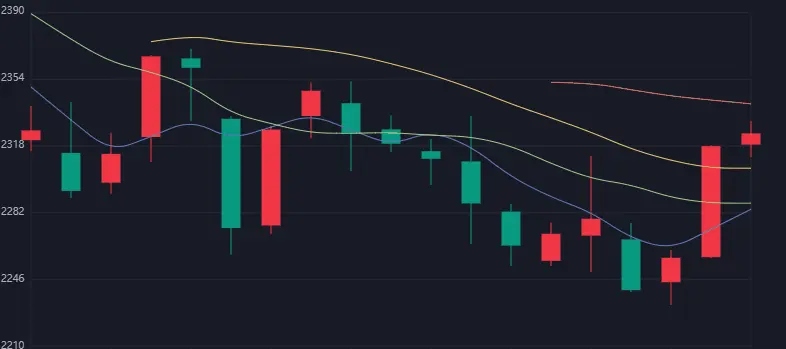
均线(Moving Average)则是一种技术分析工具,用于平滑价格数据并显示价格趋势的指标。它是通过计算一段时间内的价格平均值来绘制出来的。如下图:

常见的均线类型包括简单移动平均线(SMA)和指数移动平均线(EMA)。
- 简单移动平均线是将一段时间内的价格相加,然后除以时间段的长度来计算平均值。
- 指数移动平均线则更加重视最近的价格数据,给予它们更高的权重。
均线可以用于识别价格趋势、确定支撑和阻力水平、确认买入和卖出信号等。常见的均线周期包括 10 日均线、20 日均线、50 日均线和 200 日均线,不同周期的均线可以显示不同时间范围内的价格趋势。
使用较短期的均线(如 5MA)我们一般会采用较浅的颜色,而较长期的均线(如 20MA、50MA)则采用较深的颜色。
绘制 K 线图
了解了以上这些背景知识就足够我们开始绘制基础的 K 线图,我们首先从 option 配置开始。
option 配置
首先我们对原有 ECharts 的配置做简化调整,然后通过 splitData 处理 K 线数据和 calculateMA 处理均线数据,最后暴露出 option 配置项。
// Each item: open,close,lowest,highest
const data0 = splitData([
    ["2013/1/24", 2320.26, 2320.26, 2287.3, 2362.94],
    ["2013/1/25", 2300, 2291.3, 2218.26, 2308.38],
    ["2013/1/28", 2295.35, 2346.5, 2215.35, 2396.92],
    //...
]);

// 转换数据
function splitData(rawData) {
    const categoryData = [];
    const values = [];
    for (var i = 0; i < rawData.length; i++) {
        categoryData.push(rawData[i].splice(0, 1)[0]);
        values.push(rawData[i]);
    }
    return { categoryData: categoryData, values: values };
}

// 计算 MA 均线
function calculateMA(dayCount) {
    var result = [];
    for (var i = 0, len = data0.values.length; i < len; i++) {
        // 必须超过最小天数
        if (i < dayCount) {
            result.push("-");
            continue;
        }
        var sum = 0;
        for (var j = 0; j < dayCount; j++) {
            sum += +data0.values[i - j][1];
        }
        result.push(sum / dayCount);
    }
    return result;
}
const option = {
    grid: { left: 40, right: 40, bottom: 15, top: 20 },
    xAxis: {
        data: data0.categoryData,
        offset: 30
    },
    theme: {
        bgColor: "#171b26",
        bgLineColor: '#252834',
        textColor: '#aeb1ba',
        helpColor: '#fff',
        upColor: '#f23645',
        downColor: '#089981',
    },
    yAxis: {
        offset: 30,
    },
    area: {
        start: 30,
        end: 80,
    },
    series: [
        {
            name: "日K",
            data: data0.values,
        },
        // 5 日均线
        {
            name: "MA5",
            type: "line",
            data: calculateMA(5),
            smooth: true,
            lineStyle: { opacity: 0.5 },
        },
        // 10 日均线
        {
            name: "MA10",
            type: "line",
            data: calculateMA(10),
            smooth: true,
            lineStyle: { opacity: 0.5 },
        },
        // 20 日均线
        {
            name: "MA20",
            type: "line",
            data: calculateMA(20),
            smooth: true,
            lineStyle: { opacity: 0.5 },
        },
        // 30 日均线
        {
            name: "MA30",
            type: "line",
            data: calculateMA(30),
            smooth: true,
            lineStyle: {
                opacity: 0.5,
            },
        },
    ],
};


export { option }
KlineChart 类
export default class KlineChart {
    /** 时间集合 */
    times = []
    /** k线图集合 */
    kList = []
    /** k线图渲染长度 */
    kLen = 0
    /** 是否是第一次渲染 */
    firstInto = true
    //...
    constructor(option) {
        // 解析option,方便获取数据
        this.option = option
        this.times = option.xAxis.data
        this.kList = option.series[0].data
        this.kLen = this.kList.length
        this.view.start = option.area.start
        this.view.end = option.area.end

        // 初始化 canvas
        this.init()

        // 渲染
        this.render()
    }
}
首先获取到 option 后,我们需要转换属性挂载到类上,方便我们后续获取数据,然后在 init 中我们只会执行一次做 canvas 上下文的获取和基础配置。
init() {
    // 获取上下文
    const canvas = document.getElementById('myCanvas');
    this.canvas = canvas
    this.ctx = canvas.getContext("2d");
    this.width = canvas.width
    this.height = canvas.height

    // dpr 适配
    const dpr = window.devicePixelRatio || 1
    canvas.width = canvas.width * dpr
    canvas.height = canvas.height * dpr

    // 原点设置为左下角
    canvas.style.transform = 'scaleY(-1)'
    canvas.style.transform = `translate(${canvas.width})`
}
这里重要的关注点在于:
- dpr 适配做法:为了解决高清屏的尺寸模糊问题。
- 原点设置为左下角:我们知道 canvas 默认是屏幕坐标系,也就是原点在左上角,右侧为 x 轴的正轴,下侧为 y 轴的正轴。但是我们正常直觉使用笛卡尔坐标系会更舒服,也就是左下角为原点,右侧为 x 轴的正轴,上侧为 y 轴的正轴。这实际就是镜像翻转。但同时镜像翻转会带来一个问题——文字倒置,在后面会有对应解决方法的讲解。
render 渲染
requestAnimation() {
    const _self = this
    const { ctx, firstInto, canvas } = this
    const { theme } = this.option

    ctx.clearRect(0, 0, canvas.width, canvas.height);
    ctx.fillStyle = theme.bgColor;

    ctx.fillRect(0, 0, canvas.width, canvas.height);

    // 限制option数据
    this.limitArea()

    // 计算视口数据
    this.calcView()

    // 执行一次监听事件
    if (firstInto) this.watchEvent()

    // 绘制
    this.draw()
    requestAnimationFrame(this.requestAnimation.bind(_self))
}

render() {
    this.requestAnimation()
}
渲染我们会使用 requestAnimationFrame 来动态更新,每次帧渲染完后,都会 clearRect 清理画布。然后因为我们的图表是有动态范围的,所以我们在 limitArea 中处理 option 传递的 data 数据做分割,方便后期的滚动事件做缩放数据范围的处理。
limitArea() {
    let { start, end } = this.view
    const start_id = Math.floor(start * this.kLen / 100)
    const end_id = Math.floor(end * this.kLen / 100)
    this.view.times = this.times.slice(start_id, end_id + 1)
    this.view.kList = this.kList.slice(start_id, end_id + 1)
    this.view.kLen = this.view.kList.length
}
在 calcView 中我们会计算视口范围的辅助数据,比如视口四个点位的坐标、实体的宽度等,我们都统一挂载在 view 属性上。
export default class KlineChart {
    view = {
        /** 时间集合 */
        times: [],
        /** 过滤挤占时间集合 */
        filterTimes: [],
        /** k线图集合 */
        kList: [],
        /** y轴标签集合 */
        yLabels: [],
        /** x轴刻度x坐标集合 */
        xTicks: [],
        /** k线渲染个数 */
        kLen: 0,
        /** k线区域坐标 */
        lb: { x: 0, y: 0 },
        rt: { x: 0, y: 0 },
        rb: { x: 0, y: 0 },
        lt: { x: 0, y: 0 },
        /** k线区域尺寸 */
        width: 0,
        height: 0,
        /** 实心宽度 */
        solidWidth: 0,
        /** 绘图区域Y轴的val范围 */
        yMaxVal: 0,
        yMinVal: 0,
        yAreaVal: 0,
        /** 安全区域Y轴的val范围 */
        yMaxSafeVal: 0,
        yMinSafeVal: 0,
        /** 范围id */
        start: 0,
        end: 0,
    }
    //...
}
calcView 这里我们讲解下需要哪些辅助数据。
首先在做绘制图元的时候坐标的计算都是包含安全区外的尺寸,也就是 grid 的 left、right、top、bottom,这对于我们维护图表是很麻烦的。所以,我们需要提前计算出下图红圈的坐标点,得到这些坐标点后我们就知道 K 线图区域的宽和高,对于后期计算 x 和 y 轴的 label 都是有好处的。

其次,在 x 轴的类目值我们没有必要做缩放,但是在 Y 轴我们的值是随时变化的,我们需要缩放值映射到 0 到 100 的范围。所以,有了 yMinVal、yMinSafeVal 这些的计算,至于 Safe 安全值主要用于计算 K 线的实际范围压缩在可控区域内。
然后计算 y 的 label 集合、K 线图实体宽度、x 轴刻度坐标等。
calcView() {
    const { grid, xAxis } = this.option
    const { width, height } = this
    const distance = 20
    const step = 5
    let max_value = 0, min_value = Infinity

    // 计算视口坐标
    this.view.lb = { x: grid.left, y: grid.bottom + xAxis.offset }
    this.view.rt = { x: width - grid.right, y: height - grid.top }
    this.view.rb = { x: width - grid.right, y: grid.bottom + xAxis.offset }
    this.view.lt = { x: grid.left, y: height - grid.top }

    this.view.width = this.view.rb.x - this.view.lb.x
    this.view.height = this.view.rt.y - this.view.rb.y

    // 计算 y 轴的范围值
    this.view.kList.forEach(item => {
        max_value = Math.max(max_value, ...item)
        min_value = Math.min(min_value, ...item)
    })
    this.view.yMaxSafeVal = max_value
    this.view.yMinSafeVal = min_value

    const min_integer = Math.floor(min_value - min_value % 10)
    const max_integer = Math.floor(max_value + (10 - max_value % 10))
    this.view.yMinVal = min_integer - distance
    this.view.yMaxVal = max_integer + distance
    this.view.yAreaVal = this.view.yMaxVal - this.view.yMinVal
    const size = Math.floor(this.view.yAreaVal / step)

    // 计算y的label集合
    let yLabels = [this.view.yMinVal]
    let curY = this.view.yMinVal
    for (let i = 0; i < step; i++) {
        curY = curY + size
        yLabels.push(curY)
    }
    this.view.yLabels = yLabels

    // 计算实体宽度
    this.view.solidWidth = +(this.view.width / (this.view.kLen * 2)).toFixed(2)

    // 计算 x 轴刻度坐标
    const xDivide = this.view.width / (this.view.times.length - 1)
    let xTicks = []
    this.view.times.forEach((item, index) => {
        xTicks.push(+(index * xDivide + this.view.lb.x).toFixed(2))
    })
    this.view.xTicks = xTicks
}
draw 绘制
下面我们就开始 draw 绘制,不过在任何绘制前我们都需要封装一些基础的图元方法。
图元绘制封装如下:
// 线段图元
export function drawLine(ctx, x, y, X, Y, color = '#fff') {
    ctx.strokeStyle = color;
    ctx.lineWidth = 1;
    ctx.beginPath();
    ctx.moveTo(x, y);
    ctx.lineTo(X, Y);
    ctx.stroke();
    ctx.closePath();
}
draw 绘制如下:
draw() {
    /** 绘制X轴 */
    this.drawAxisX()
    /** 绘制Y轴 */
    this.drawAxisY()
    /** 绘制X比例尺 */
    this.drawScaleX()
    /** 绘制Y比例尺 */
    this.drawScaleY()
    /** 绘制网格线 */
    this.drawGrid()
    /** 绘制k线 */
    this.drawK()
    /** 绘制辅助线 */
    this.drawHelpLine()
}
drawAxis 绘制轴
有了之前的 view 数据,接下来的绘制就会方便很多,我们首先看绘制轴:
drawAxisX() {
    const { lb, rb } = this.view
    const { theme } = this.option
    drawLine(this.ctx, lb.x, lb.y, rb.x, rb.y, theme.bgLineColor)
}

drawAxisY() {
    const { lb, lt, rb } = this.view
    const { theme } = this.option
    drawLine(this.ctx, lb.x, lb.y, lt.x, lt.y, theme.bgLineColor)
    drawLine(this.ctx, rb.x, lb.y, rb.x, lt.y, theme.bgLineColor)
}
在 drawAxisX 中,通过 lb 左下角的坐标点和 rb 右下角的坐标点我们直接用 drawLine 绘制即可。drawAxisY 亦是同理。
drawScaleX 绘制比例尺
绘制比例尺主要分为两个步骤:1. 绘制刻度;2. 绘制标注。
drawScaleX() {
    const { ctx } = this
    const { xTicks, lb, filterTimes } = this.view
    const { theme } = this.option
    // 1.绘制刻度
    // xTick: x 轴的刻度 x 坐标值的集合
    xTicks.forEach(x => {
        ctx.beginPath()
        ctx.moveTo(x, lb.y)
        ctx.lineTo(x, lb.y - 10)
        ctx.stroke()
    })
    ctx.save()
    // 垂直翻转
    ctx.scale(1, -1)

    // 2. 绘制标注
    xTicks.forEach((x, index) => {
        ctx.fillStyle = theme.textColor
        ctx.fillText(filterTimes[index], x - 25, -(lb.y - 20))
    })
    ctx.restore()
}

drawScaleY() {
    const { ctx } = this
    const { lb, height, yLabels } = this.view
    const { theme } = this.option

    const divide = height / (yLabels.length - 1)
    ctx.save()
    // 垂直翻转
    ctx.scale(1, -1)
    yLabels.forEach((val, index) => {
        ctx.fillStyle = theme.textColor
        ctx.fillText(val, 10, -(lb.y + index * divide - 3))
    })
    ctx.restore()
}
在绘制标注正常情况下会出现文本倒置的问题,如下:

ctx.scale(1, -1)
//...
ctx.fillText(times[index], x - 20, -(lb.y - 20))
解决方式:scale 在 y 轴镜像后,同时对绘制文本的 view.lb.y 取反。
最后,为了翻转不影响之后的上下文绘制,所以在之前我们先 ctx.save 保存状态到栈顶,ctx.restore 恢复到存储在栈顶的状态。
为了方便后续的开发,我们封装下绘制文本的方法:
export function drawText(ctx, val, x, y, { color, fontSize }) {
    ctx.save()
    ctx.scale(1, -1)
    ctx.font = `${fontSize}px Arial`;
    ctx.fillStyle = color
    ctx.fillText(val, x, -y)
    ctx.restore()
}
drawGrid 绘制网格线
drawGrid() {
    const { lb, rb, yLabels } = this.view
    const { theme } = this.option
    const divide = this.height / (yLabels.length)
    yLabels.forEach((val, index) => {
        if (index) {
            const y = lb.y + index * divide
            drawLine(this.ctx, lb.x, y, rb.x, y, theme.bgLineColor)
        }
    })
}
最后绘制效果:

drawCandle 绘制蜡烛
drawK() {
    let candleCenters = []
    this.view.kList.forEach((item, index) => {
        const { center } = this.drawCandle(item, this.view.times[index])
        candleCenters.push(center)
    })
    this.view.candleCenters = candleCenters
}
在 drawK 中,我们只要知道 item 的收盘价、开盘价、最大涨幅和跌幅以及时间,即可计算出坐标。在 drawCandle 中,主要做了 Y 轴和 X 轴的值映射。candleCenters 主要收集蜡烛实体的中心坐标。
drawCandle(item, name) {
    const { ctx } = this
    const { theme } = this.option

    // 缩放后的 实心底部, 实心顶部,lowest,highest的y值
    const solidBottom = Math.min(this.y_toPos(item[0]), this.y_toPos(item[1]))
    const solidTop = Math.max(this.y_toPos(item[0]), this.y_toPos(item[1]))
    const lowest = this.y_toPos(item[2])
    const highest = this.y_toPos(item[3])
    const h = Math.abs(solidTop - solidBottom)
    const w = this.view.solidWidth
    const half_w = w * .5
    const half_h = h * .5

    const isUp = item[1] > item[0]
    const color = isUp ? theme.upColor : theme.downColor

    // 实心区域中心点
    const center = {
        x: this.x_toPos(name),
        y: solidBottom + half_h
    }
    // 绘制蜡烛图的上下影线
    ctx.strokeStyle = color;
    ctx.beginPath();
    ctx.moveTo(center.x, highest);
    ctx.lineTo(center.x, lowest);
    ctx.stroke();
    // 绘制蜡烛图的实体部分
    ctx.fillStyle = color
    ctx.fillRect(center.x - half_w, center.y - half_h, w, h)
}
我们首先要计算得到实际的绘制坐标 solidBottom、solidTop、lowest、highest,而得到这些关键的值我们需要做映射转换 y_toPos。同理,中心点的 x 值需要 x_toPos 映射。
// 数值转为y轴坐标
y_toPos(val) {
    const { height, yAreaVal, yMinSafeVal, yMaxSafeVal, yMinVal, yMaxVal, lb } = this.view
    const safeBottomH = ((yMinSafeVal - yMinVal) / yAreaVal) * height
    const safeTopH = ((yMaxVal - yMaxSafeVal) / yAreaVal) * height
    const valH = ((val - yMinSafeVal) / (yMaxSafeVal - yMinSafeVal)) * (height - safeBottomH - safeTopH)
    return +(lb.y + safeBottomH + valH).toFixed(2)
}

// x 数值转为x轴坐标
x_toPos(name) {
    let { times, width, kLen, lb } = this.view
    const idx = times.findIndex(item => item === name)
    const x_divide = width / (kLen - 1)
    return +(lb.x + x_divide * idx).toFixed(2)
}
最后就是绘制部分了。我们知道 Canvas 绘制 rect 矩形都是左下角开始的,那么我们只要知道中心点的坐标就很容易绘制实体部分,而不用判断是阳线还是阴线然后再做对应的尺寸计算。
另外还有一个核心的点在于,我们需要较少绘制 API 的使用,“绘制上影线和下影线”看着像需要绘制两遍,但其实只要绘制贯穿线一次即可。同时注意实体要在贯穿线后绘制,以起到遮挡效果。

整体绘制效果如下:
现在我们已经成功了一大半了,接下来可以很方便添砖加瓦,比如绘制之前我们在 option 配置传入的 MA5、MA10、MA20、MA30 这些均线。
drawAvgLine 绘制均线
在绘制前,我们先封装绘制折线、曲线的图元方法:
export function drawPolyline(ctx, points, color, lineWidth) {
    ctx.beginPath();
    ctx.strokeStyle = color;
    ctx.lineWidth = lineWidth;
    ctx.moveTo(points[0][0], points[0][1]);
    for (let i = 1; i < points.length; i++) {
        ctx.lineTo(points[i][0], points[i][1]);
    }
    ctx.stroke();
}

export function drawCurve(ctx, points, color, lineWidth) {
    ctx.beginPath();
    ctx.strokeStyle = color;
    ctx.lineWidth = lineWidth;

    // 绘制起始点
    ctx.moveTo(points[0][0], points[0][1]);

    // 将每个折线点转换为曲线点
    for (let i = 1; i < points.length - 1; i++) {
        const x = (points[i][0] + points[i + 1][0]) / 2;
        const y = (points[i][1] + points[i + 1][1]) / 2;
        ctx.quadraticCurveTo(points[i][0], points[i][1], x, y);
    }

    // 绘制最后一个点
    ctx.lineTo(points[points.length - 1][0], points[points.length - 1][1]);

    ctx.stroke();
}
接下来我们只要控制好范围,将数据转为二维数组即可,就像下面的用法一样。
const canvas = document.getElementById('myCanvas');
const ctx = canvas.getContext('2d');

const points = [
  [50, 50],
  [100, 150],
  [200, 100],
  [250, 200]
];

drawCurve(ctx, points, 'red', 2);
我们先限制范围:
limitArea() {
    //...
    this.view.series = this.series.map(item => {
        return { ...item, data: item.data.slice(start_id, end_id + 1) }
    })
}
数据转换:
calcView() {
    // 转换曲线
    // ['-', '-', 11, 22, 33] -> [[x1, y1], [x2, y2], [x3, y3]]
    this.view.series.forEach(item => {
        let lines = []
        const data = item.data
        data.forEach((x, j) => {
            const val = data[j]
            if (val !== '-') {
                lines.push([this.view.xTicksSum[j], this.y_toPos(val)])
            }
        })
        item.lines = lines
    })
}
开始绘制:
drawAvgLine() {
    this.view.series.forEach(item => {
        drawCurve(this.ctx, item.lines, item.lineStyle.color, 1);
    });
}
最后效果:
后续的事件交互、性能优化部分内容可以点击下方链接查阅掘金小册相关章节:
前端可视化入门与实战 – 谦宇 – 掘金小册 (juejin.cn)
原文链接:https://juejin.cn/post/7324750302321721382 作者:谦宇