

前言
当前 Antd 版本:5.14.0
Antd 自定义表单控件
自定义或第三方的表单控件,也可以与 Form 组件一起使用。只要该组件遵循以下的约定:
- 提供受控属性
value或其它与valuePropName的值同名的属性。- 提供
onChange事件或trigger的值同名的事件。
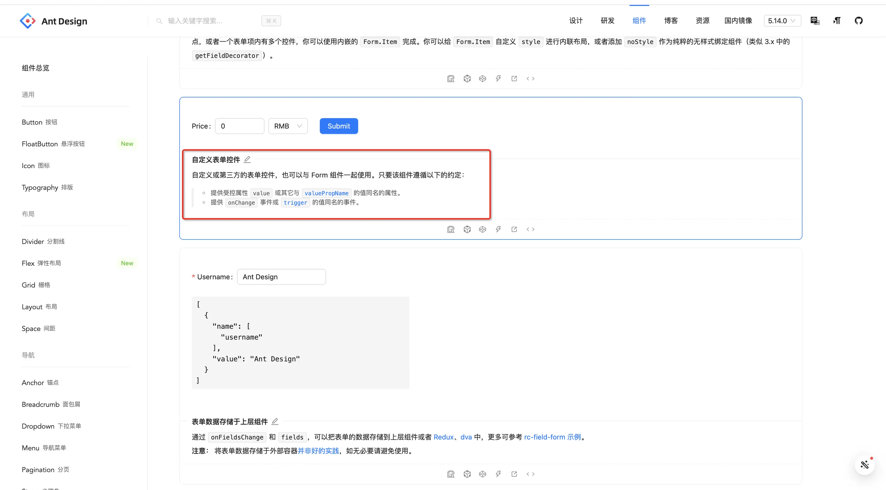
也就是说我们的自定义组件想要和 Antd 的 Form 组件搭配使用,实现统一的表单检验等行为,我们只需要让我们的自定义组件向外提供一个 value 属性,和一个 onChange 事件(用于更新 value 值)即可。明白了这点,接下来我们就自定义一个表单控件,用于选择 Icon 图标。
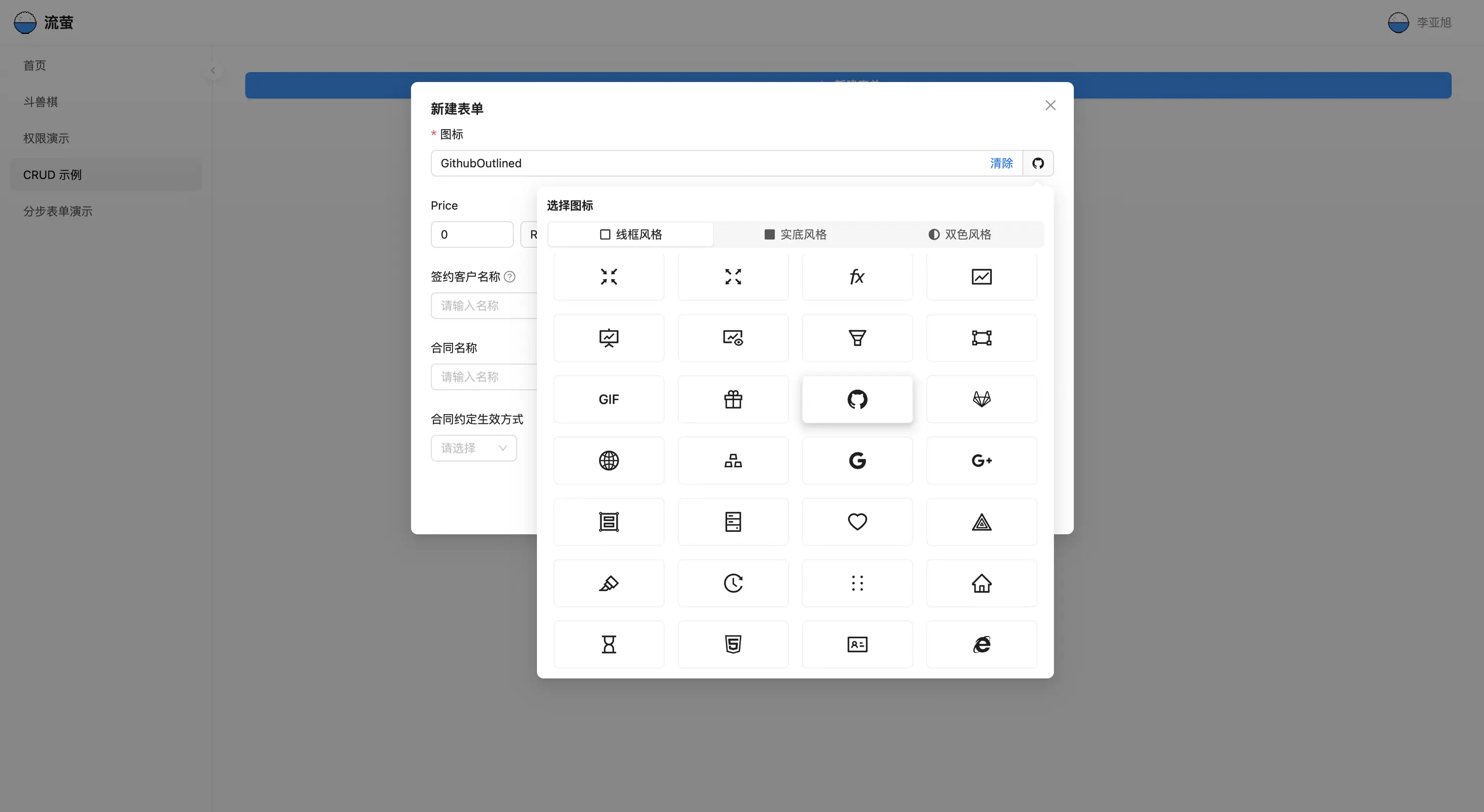
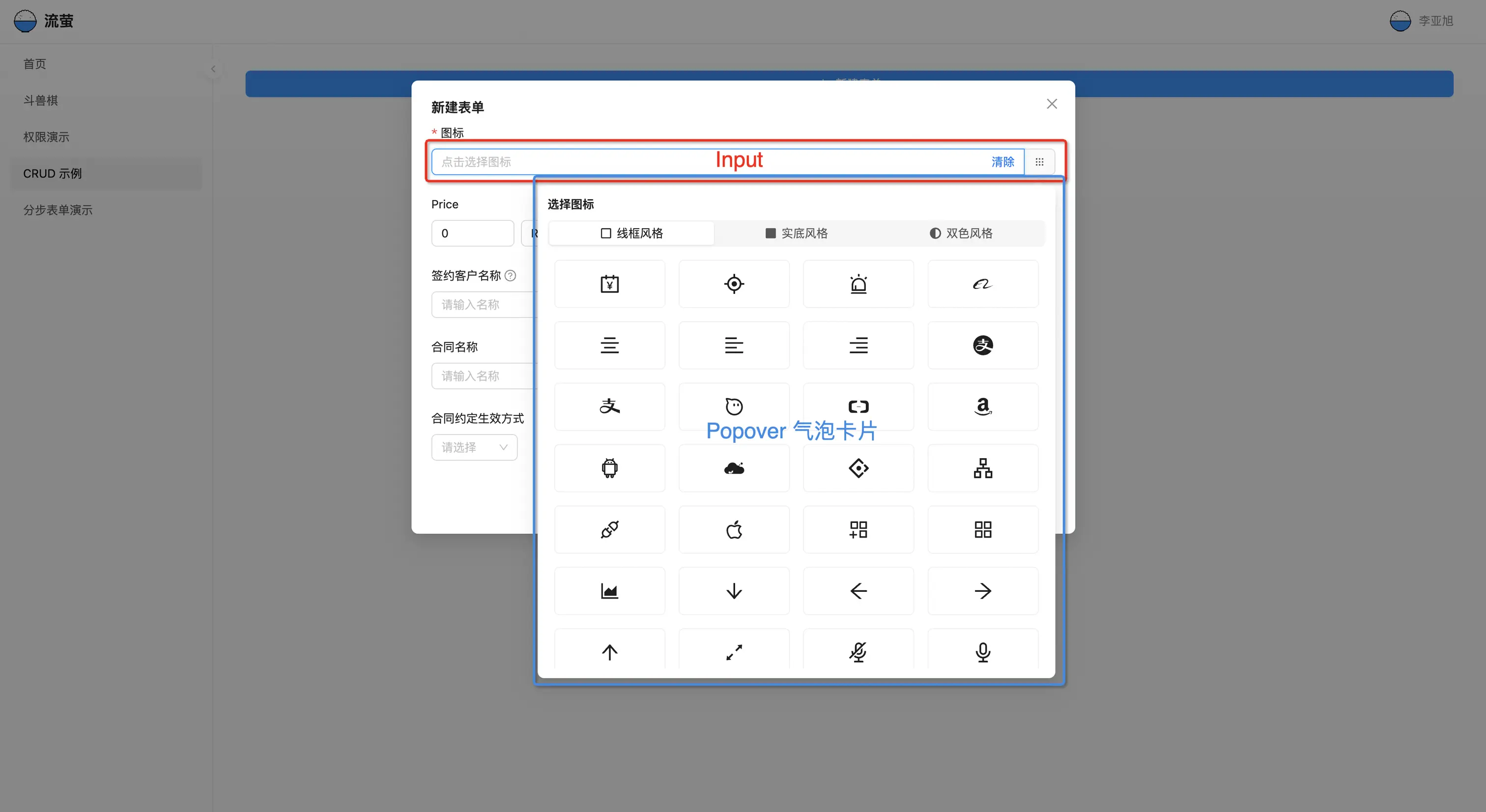
Icon 选择器的结构分析
我们的 Icon 选择器由 2 部分组成:
Input组件:用于显示选中 Icon 图标的名称,同时也由 3 部分构成suffix:是一个清除按钮,可以清除选择addonAfter:展示当前选中图标的预览效果- Input主体区域:显示选中 Icon 图标的名称
Popover组件:用于展示所有可选择的 Icon 图标,由 2 部分构成- 最上面是一个
Segmented分段控制器:用于切换图标风格 - 下面是一个可滚动容器,里面存放对应风格的图标
- 最上面是一个
实现 Icon 选择器
import React, { useState, useMemo } from 'react'
import { Input, Popover, Segmented } from 'antd';
import * as AntdIcons from '@ant-design/icons';
import Icon from '@ant-design/icons';
import { ProCard } from '@ant-design/pro-components';
interface IconSelectProps {
value?: string;
onChange?: (value: string) => void;
}
const OutlinedIcon = (props: any) => (
<Icon {...props} component={() => (<svg width="1em" height="1em" fill="currentColor" aria-hidden="true" focusable="false" viewBox="0 0 1024 1024"><path d="M864 64H160C107 64 64 107 64 160v704c0 53 43 96 96 96h704c53 0 96-43 96-96V160c0-53-43-96-96-96z m-12 800H172c-6.6 0-12-5.4-12-12V172c0-6.6 5.4-12 12-12h680c6.6 0 12 5.4 12 12v680c0 6.6-5.4 12-12 12z"></path></svg>)} />
);
const FilledIcon = (props: any) => (
<Icon {...props} component={() => (<svg width="1em" height="1em" fill="currentColor" aria-hidden="true" focusable="false" viewBox="0 0 1024 1024"><path d="M864 64H160C107 64 64 107 64 160v704c0 53 43 96 96 96h704c53 0 96-43 96-96V160c0-53-43-96-96-96z"></path></svg>)} />
);
const TwoToneIcon = (props: any) => (
<Icon {...props} component={() => (<svg width="1em" height="1em" fill="currentColor" aria-hidden="true" focusable="false" viewBox="0 0 1024 1024"><path d="M16 512c0 273.932 222.066 496 496 496s496-222.068 496-496S785.932 16 512 16 16 238.066 16 512z m496 368V144c203.41 0 368 164.622 368 368 0 203.41-164.622 368-368 368z"></path></svg>)} />
);
const MoreIcon = (props: any) => (
<Icon {...props} component={() => (<svg width="1em" height="1em" fill="currentColor" aria-hidden="true" focusable="false" viewBox="0 0 1024 1024"><path d="M249.787181 328.164281A74.553827 74.553827 0 1 0 175.233354 254.884879a73.916615 73.916615 0 0 0 74.553827 73.279402zM509.769757 328.164281A74.553827 74.553827 0 1 0 435.21593 254.884879 74.553827 74.553827 0 0 0 509.769757 328.164281zM769.752334 328.164281A74.553827 74.553827 0 1 0 695.835719 254.884879a73.916615 73.916615 0 0 0 73.916615 73.916614zM249.787181 588.78407a74.553827 74.553827 0 1 0-74.553827-74.553827 73.916615 73.916615 0 0 0 74.553827 74.553827zM509.769757 588.78407a74.553827 74.553827 0 1 0-74.553827-74.553827A74.553827 74.553827 0 0 0 509.769757 588.78407zM769.752334 588.78407a74.553827 74.553827 0 1 0-73.916615-74.553827 74.553827 74.553827 0 0 0 73.916615 74.553827zM249.787181 848.766646a74.553827 74.553827 0 1 0-74.553827-74.553827 73.916615 73.916615 0 0 0 74.553827 74.553827zM509.769757 848.766646a74.553827 74.553827 0 1 0-74.553827-74.553827A74.553827 74.553827 0 0 0 509.769757 848.766646zM769.752334 848.766646a74.553827 74.553827 0 1 0-73.916615-74.553827 74.553827 74.553827 0 0 0 73.916615 74.553827z" fill="#555555" p-id="29002"></path></svg>)} />
);
const allIcons: {
[key: string]: any;
} = AntdIcons;
const IconSelect: React.FC<IconSelectProps> = ({ value, onChange }) => {
const [popoverOpen, setPopoverOpen] = useState(false);
const [iconTheme, setIconTheme] = useState<'Outlined' | 'Filled' | 'TwoTone'>('Outlined');
const visibleIconList = useMemo(
() => Object.keys(allIcons)
.filter(iconName => iconName.includes(iconTheme) && iconName !== 'getTwoToneColor' && iconName !== 'setTwoToneColor'),
[iconTheme],
);
const SelectedIcon = value ? allIcons[value] : MoreIcon;
return (
<Popover
title="选择图标"
placement="bottomRight"
arrow={true}
trigger="click"
open={popoverOpen}
content={(
<div style={{ width: 600 }}>
<Segmented
options={[
{ label: '线框风格', value: 'Outlined', icon: <OutlinedIcon /> },
{ label: '实底风格', value: 'Filled', icon: <FilledIcon /> },
{ label: '双色风格', value: 'TwoTone', icon: <TwoToneIcon /> },
]}
block
onChange={(value: any) => {
setIconTheme(value);
}} />
<ProCard
gutter={[16, 16]}
wrap
style={{ marginTop: 8 }}
bodyStyle={{ height: 500, overflowY: 'auto', paddingInline: 0, paddingBlock: 0 }}
>
{
visibleIconList.map(iconName => {
const Component = allIcons[iconName];
return (
<ProCard key={iconName}
colSpan={{ xs: 6, sm: 6, md: 6, lg: 6, xl: 6 }}
layout="center"
bordered
hoverable
boxShadow={value === iconName}
onClick={() => {
onChange?.(iconName);
setPopoverOpen(false);
}}
>
<Component style={{ fontSize: '24px' }} />
{/* <p>{iconName}</p> */}
</ProCard>
);
})
}
</ProCard>
</div>
)}>
<Input
type="text"
value={value}
onFocus={() => setPopoverOpen(true)}
placeholder='点击选择图标'
readOnly
onChange={(e) => { onChange?.(e.target.value) }}
suffix={<a onClick={(e) => {
e.stopPropagation();
onChange?.('');
setPopoverOpen(false);
}}>清除</a>}
addonAfter={<SelectedIcon
style={{
cursor: 'pointer'
}}
onClick={() => setPopoverOpen(!popoverOpen)} />}
/>
</Popover>
)
}
export default IconSelect;
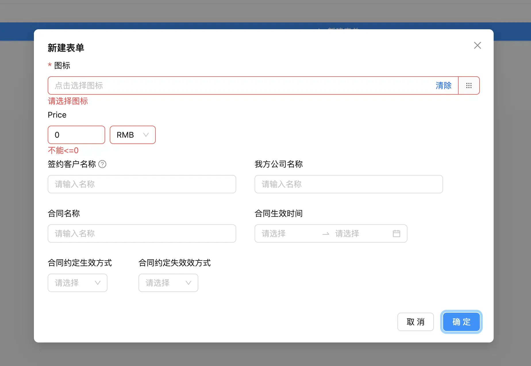
最后在 Form 组件里面使用,并验证下效果
import { PlusOutlined } from '@ant-design/icons';
import {
ModalForm,
ProForm,
ProFormDateRangePicker,
ProFormSelect,
ProFormText,
} from '@ant-design/pro-components';
import { Button, Form, message } from 'antd';
import PriceInput from './components/PriceInput'
import IconSelect from './components/IconSelect';
const waitTime = (time: number = 100) => {
return new Promise((resolve) => {
setTimeout(() => {
resolve(true);
}, time);
});
};
export default () => {
const [form] = Form.useForm<{ name: string; company: string }>();
return (
<ModalForm>
title="新建表单"
form={form}
onFinish={async (values) => {
await waitTime(2000);
message.success('提交成功');
return true;
}}
>
<Form.Item name="icon" label="图标" rules={[{ required: true, message: '请选择图标' }]}>
<IconSelect />
</Form.Item>
</ModalForm>
);
};
原文链接:https://juejin.cn/post/7332102508976996362 作者:xxch