

📌前言
css实现动画有两种方式:
transition过渡动画、animation自定义动画。文章只记录编码中需要并常用的 , 晦涩不常用的就不介绍了, 想学习的同学可以自行搜索相关资料。
本篇介绍animation自定义动画,学习过渡动画请跳转🔥 一篇学会CSS过度动画transition。
💡学前须知
以下是w3school关于animation属性的定义
| animation-name | 规定需要绑定到选择器的 keyframe 名称。 |
|---|---|
| animation-duration | 规定完成动画所花费的时间,以秒或毫秒计。 |
| animation-timing-function | 规定动画的速度曲线。 |
| animation-delay | 规定在动画开始之前的延迟。 |
| animation-iteration-count | 规定动画应该播放的次数。 |
| animation-direction | 规定是否应该轮流反向播放动画。 |
| animation-fill-mode | 规定动画在执行时间之外应用的值。 |
| animation-play-state | 规定动画是正在运行还是暂停。 |
下面介绍上述属性以及@keyframes
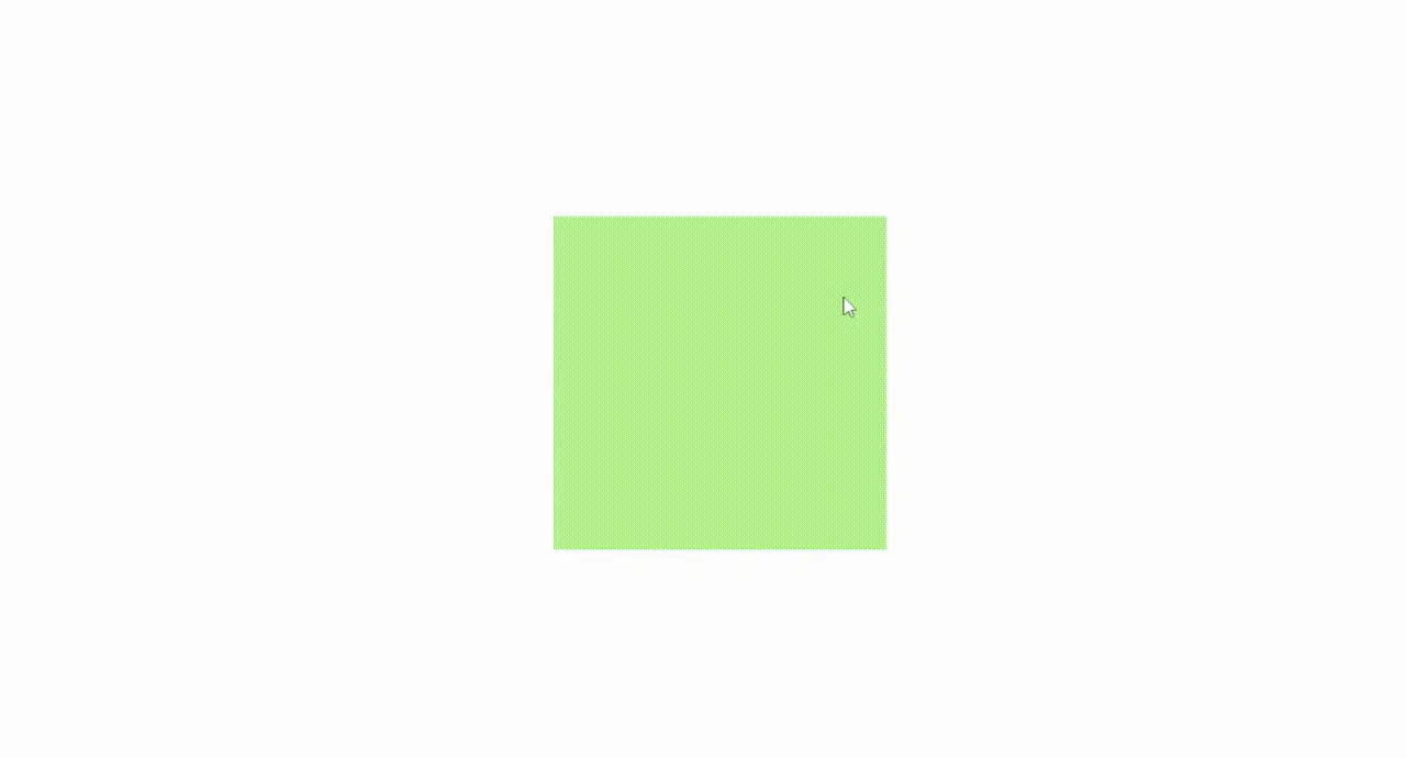
🎲@keyframes自定义动画
自定义动画是通过@keyframes自定义关键帧动画并为动画命名 , 通过我们在每一帧设置不同的值完成转换效果。
通过百分比设置在什么阶段呈现什么效果
@keyframes animateName{
   0% {
    width:100px;
    height:100px;
  }
  30% {
    width:200px;
    height:200px;
    background:#fcbbb5;
  }
  50% {
    width:300px;
    height:300px;
    background: #fab677;
  }
  100% {
    width:200px;
    height:200px;
    background: #00aaff;
    border-radius: 50%;
  }
}
注意:这里有两个细节
0%可以使用from代替 ,100%可以使用to代替0%和100%默认为使用者原本的样式
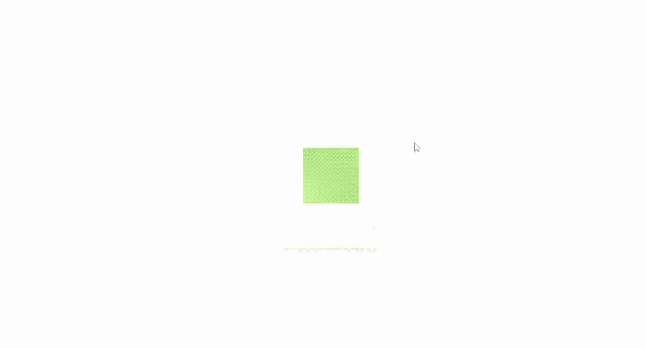
🍉animation[name,duration]动画名称和执行时间
如果单独使用animation-name但是未定义执行时间 , 那默认时间为0s , 页面不会有任何变化 , 所以将它们放在一起了。
示例

将上述animateName动画加入 , 设置3s动画时间
<div class="divClass"></div>
.divClass{
  width: 300px;
  height: 300px;
  background: #b5f18e;
  /* 动画名称 */
  animation-name: animateName;
  /* 动画时间 */
  animation-duration: 3s;
}
@keyframes animateName{
  0% {
    width:100px;
    height:100px;
  }
  30% {
    width:200px;
    height:200px;
    background:#fcbbb5;
  }
  50% {
    width:300px;
    height:300px;
    background: #fab677;
  }
  100% {
    width:200px;
    height:200px;
    background: #00aaff;
    border-radius: 50%;
  }
}
注意:动画时间单位有 s 和 ms 两种
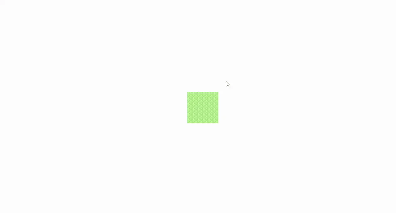
🍈animation-timing-function动画执行方式(速度曲线)
| 值 | 描述 |
|---|---|
| linear | 动画从头到尾的速度是相同的。 |
| ease(缓解) | 默认值:动画以低速开始,然后加快,在结束前变慢。 |
| ease-in | 动画以低速开始。 |
| ease-out | 动画以低速结束。 |
| ease-in-out | 动画以低速开始和结束。 |
| cubic-bezier(n,n,n,n) | 贝塞尔曲线(自定义数值),可到相关网站可视化设置。 |
示例

设置执行方式为ease-in-out动画以低速开始和结束
<div class="divClass"></div>
.divClass{
  width: 300px;
  height: 300px;
  background: #b5f18e;
  /* 动画名称 */
  animation-name: animateName;
  /* 动画时间 */
  animation-duration: 3s;
   /* 执行方式 */
  animation-timing-function:ease-in-out;
}
@keyframes animateName{
  0% {
    width:100px;
    height:100px;
  }
  30% {
    width:200px;
    height:200px;
    background:#fcbbb5;
  }
  50% {
    width:300px;
    height:300px;
    background: #fab677;
  }
  100% {
    width:200px;
    height:200px;
    background: #00aaff;
    border-radius: 50%;
  }
}
🍇animation-delay动画延迟
这个就不多介绍了 , 就是字面意思 。
假设设置为1s那动画1s之后才会开始执行。
注意:动画延迟单位有 s 和 ms 两种
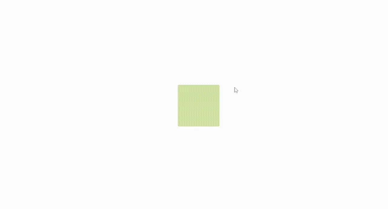
🍓animation-iteration-count动画执行次数
默认为
1,infinite为循环执行
示例

设置为循环执行
<div class="divClass"></div>
.divClass{
  width: 300px;
  height: 300px;
  background: #b5f18e;
  /* 动画名称 */
  animation-name: animateName;
  /* 动画时间 */
  animation-duration: 3s;
   /* 执行方式 */
  animation-timing-function:ease-in-out;
   /* 执行次数 */
  animation-iteration-count:infinite;
}
@keyframes animateName{
  0% {
    width:100px;
    height:100px;
  }
  30% {
    width:200px;
    height:200px;
    background:#fcbbb5;
  }
  50% {
    width:300px;
    height:300px;
    background: #fab677;
  }
  100% {
    width:200px;
    height:200px;
    background: #00aaff;
    border-radius: 50%;
  }
}
🏕animation-direction 是否轮流播放
默认值为
normal, 可设置为alternate
值为alternate时,动画会在奇数次正常播放,而在偶数次反向播放 , 达成轮流播放的效果。
示例
注意:如果把动画执行参数设置为只播放一次,则该属性没有效果。
<div class="divClass"></div>
.divClass{
  width: 300px;
  height: 300px;
  background: #b5f18e;
  /* 动画名称 */
  animation-name: animateName;
  /* 动画时间 */
  animation-duration: 3s;
  /* 执行方式 */
  animation-timing-function:ease-in-out;
  /* 执行次数 */
  animation-iteration-count:infinite;
  /* 是否轮流播放 */
  animation-direction: alternate;
}
@keyframes animateName{
  0% {
    width:100px;
    height:100px;
  }
  30% {
    width:200px;
    height:200px;
    background:#fcbbb5;
  }
  50% {
    width:300px;
    height:300px;
    background: #fab677;
  }
  100% {
    width:200px;
    height:200px;
    background: #00aaff;
    border-radius: 50%;
  }
}
🎉animation-fill-mode动画执行前后
正常情况下元素在执行动画前后的样式就是自己本身的样式 , 但是你可以设置animation-fill-mode属性,将它的样式改为动画帧的样式。
| 值 | 描述 |
|---|---|
| none | 默认值: 不改变默认行为。 |
| forwards | 动画完成后 ,样式保持在最后一帧(100%) |
| backwards | 动画开始前 , 样式为第一帧的样式(0%) |
| both | 动画开始前 , 样式为第一帧(0%) , 完成后保持在最后一帧(100%) |
示例
设置为both动画开始前 , 样式为第一帧(0%) , 完成后保持在最后一帧(100%)
<div class="divClass"></div>
.divClass{
  width: 300px;
  height: 300px;
  background: #b5f18e;
  /* 动画名称 */
  animation-name: animateName;
  /* 动画时间 */
  animation-duration: 3s;
  /* 动画延迟时间 */
  animation-delay: 1s;
  /* 动画执行前后样式 */
  animation-fill-mode: both;
}
@keyframes animateName{
  0% {
    width:100px;
    height:100px;
  }
  30% {
    width:200px;
    height:200px;
    background:#fcbbb5;
  }
  50% {
    width:300px;
    height:300px;
    background: #fab677;
  }
  100% {
    width:200px;
    height:200px;
    background: #00aaff;
    border-radius: 50%;
  }
}
🎊animation-play-state播放暂停动画
在编码过程中 , 我们有时并不希望它直接执行动画 , 所以可以通过设置animation-play-state去播放和暂停动画。
| 值 | 描述 |
|---|---|
| running | 默认值: 播放。 |
| paused | 暂停。 |
🍀animation简写
以下六个属性不一定要分开写 , 下面是简写
定义顺序分别为:
- animation-name
- animation-duration
- animation-timing-function
- animation-delay
- animation-iteration-count
- animation-direction
animation: animateName 3s linear 1s infinite alternate;
🥰animation-name 多动画
当一个动画的@keyframes不能满足需求时 , 我们可以在一个元素中同时实现多种动画。
animation-name使用多种属性 , 逗号分割
示例
<div class="divClass"></div>
.divClass{
  width: 300px;
  height: 300px;
  background: #b5f18e;
  /* 动画名称 */
  animation-name: animateName , opcity;
  /* 动画时间 */
  animation-duration: 3s;
  /* 动画延迟时间 */
  animation-delay: 1s;
  /* 动画执行前后 */
  animation-fill-mode: both;
}
@keyframes animateName{
  0% {
    width:100px;
    height:100px;
  }
  30% {
    width:200px;
    height:200px;
    background:#fcbbb5;
  }
  50% {
    width:300px;
    height:300px;
    background: #fab677;
  }
  100% {
    width:200px;
    height:200px;
    background: #00aaff;
    border-radius: 50%;
  }
}
@keyframes opcity {
  50% {
    opacity: 0.4;
  }
  100% {
    opacity: 0;
  }
}
📚总结
答应我 , 一定要学会!!!
原文链接:https://juejin.cn/post/7348621590580084762 作者:moodEngineer