
在今天的网页设计中,CSS动画已成为一种流行的工具,用于增强用户体验和页面的视觉吸引力。通过简单的CSS代码,您可以创建流畅的动画效果,以吸引访问者的注意力,并提供更加动态的交互体验。
CSS动画基础
CSS动画允许开发者通过简单的CSS属性和@keyframes规则来创建平滑的动态效果。这些动画可以控制网页上任何可动画的CSS属性的时间序列。
CSS动画的工作原理
CSS动画的核心是@keyframes规则,这个规则定义了动画过程中某个CSS属性的值是如何随时间改变的。此外,一系列动画相关的属性如animation-name, animation-duration, animation-timing-function, animation-delay, animation-iteration-count, animation-direction, 和animation-fill-mode等控制动画的行为。
创建第一个CSS动画
一个简单的动画示例可以是让一个元素从屏幕的一边移动到另一边。
CSS代码:
@keyframes moveRight {
    from { transform: translateX(0); }
    to { transform: translateX(100%); }
}

.moving-element {
    width: 100px;
    height: 100px;
    background-color: red;
    animation: moveRight 5s infinite alternate;
}
HTML代码:
<div class="moving-element"></div>
在这个例子中,.moving-element将会从它的起始位置向右移动屏幕的宽度,然后返回,无限重复。效果如下:


探索CSS动画属性
animation-duration
定义动画从开始到结束的时长,如2s或200ms。
animation-timing-function
这个属性定义动画的速度曲线。常用的值包括linear, ease, ease-in, ease-out, 和ease-in-out,也可以使用cubic-bezier函数来自定义动画的速度曲线。
animation-delay
设置动画开始前的延迟时间,允许你推迟动画的开始。
animation-iteration-count
定义动画的重复次数。可以是数字或infinite,表示动画无限次重复。
animation-direction
控制动画播放的方向。默认是normal,还可以设置为reverse,或者alternate(交替反向)。
animation-fill-mode
指定在动画执行之前和之后如何应用样式。比如forwards会在动画完成后保留最后一帧的样式。
实现复杂动画
利用基础动画属性和@keyframes,我们可以创建更加复杂的动画效果。
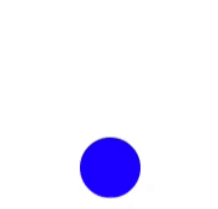
创建一个弹跳球动画
通过添加多个关键帧来模拟球的弹跳效果。
CSS代码:
@keyframes bounce {
    0%, 100% { transform: translateY(0); }
    50% { transform: translateY(-100px); }
}

.bouncing-ball {
    width: 50px;
    height: 50px;
    background-color: blue;
    border-radius: 50%;
    animation: bounce 2s infinite;
}
HTML代码:
<div class="bouncing-ball"></div>
这段代码创建了一个不断上下弹跳的球体动画,模拟重力对球的影响。效果如下:
综合应用动画
结合多个动画属性和关键帧,我们可以创建更加丰富和复杂的动画序列。
CSS代码:
@keyframes complexAnimation {
    0% { transform: translateX(0) rotate(0deg); }
    25% { transform: translateX(200px) rotate(90deg); }
    50% { transform: translateX(200px) translateY(200px) rotate(180deg); }
    75% { transform: translateY(200px) rotate(270deg); }
    100% { transform: translateX(0) translateY(0) rotate(360deg); }
}

.complex-element {
    width: 100px;
    height: 100px;
    background-color: green;
    animation: complexAnimation 10s infinite;
}
HTML代码:
<div class="complex-element"></div>
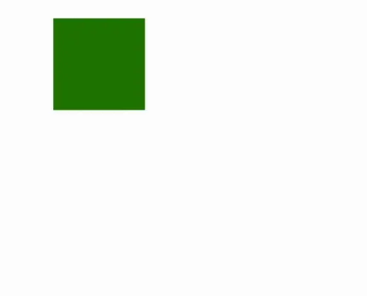
这个动画使元素在一个方形路径上移动,同时进行旋转。效果如下:
CSS动画应用于实际项目
创建一个完整的项目示例,展示如何将CSS动画集成到一个实际的网页中。
完整的HTML页面代码:
<!DOCTYPE html>
<html lang="en">
<head>
    <meta charset="UTF-8">
    <meta name="viewport" content="width=device-width, initial-scale=1.0">
    <title>Comprehensive CSS Animation Example</title>
    <style>
        @keyframes moveRight {
            from { transform: translateX(0); }
            to { transform: translateX(100%); }
        }
        .moving-element {
            width: 100px;
            height: 100px;
            background-color: red;
            animation: moveRight 5s infinite alternate;
        }
        @keyframes bounce {
            0%, 100% { transform: translateY(0); }
            50% { transform: translateY(-100px); }
        }
        .bouncing-ball {
            width: 50px;
            height: 50px;
            background-color: blue;
            border-radius: 50%;
            animation: bounce 2s infinite;
        }
        @keyframes complexAnimation {
            0% { transform: translateX(0) rotate(0deg); }
            25% { transform: translateX(200px) rotate(90deg); }
            50% { transform: translateX(200px) translateY(200px) rotate(180deg); }
            75% { transform: translateY(200px) rotate(270deg); }
            100% { transform: translateX(0) translateY(0) rotate(360deg); }
        }
        .complex-element {
            width: 100px;
            height: 100px;
            background-color: green;
            animation: complexAnimation 5s infinite;
        }
    </style>
</head>
<body>
    <div class="moving-element"></div>
    <div class="bouncing-ball"></div>
    <div class="complex-element"></div>
</body>
</html>
通过访问这个HTML页面,你可以看到所有的动画效果:
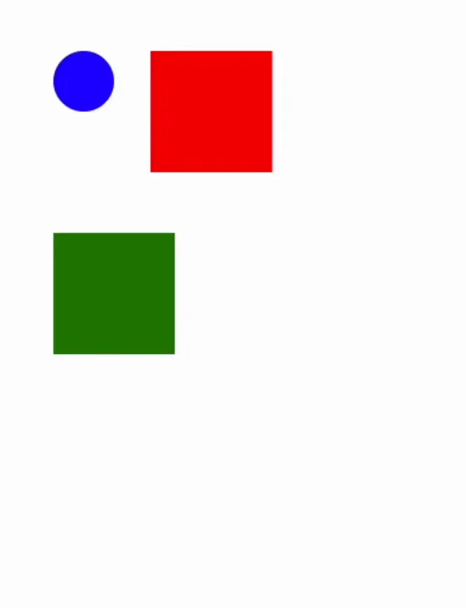
这个示例展示了CSS动画的多样性和强大功能,适用于各种网页设计项目。
原文链接:https://juejin.cn/post/7356860329697280063 作者:指尖上的生活