
是啊,Tab啊,滑动啊,点击啊,它是个混蛋啊。每个App都要写的啊。
但是不论如何,flutter官方封装的,拯救了我们的时间。
但是官方效果有限,既然如此。整活吧。
由由由由由由由浅入深,让小白来了,也能哇偶,明明明明明明明明了。
后面呢,搞点自定义。
比如:

在比如:
Emm,哪怕是微信,底部也是几个选项卡。几个tab。
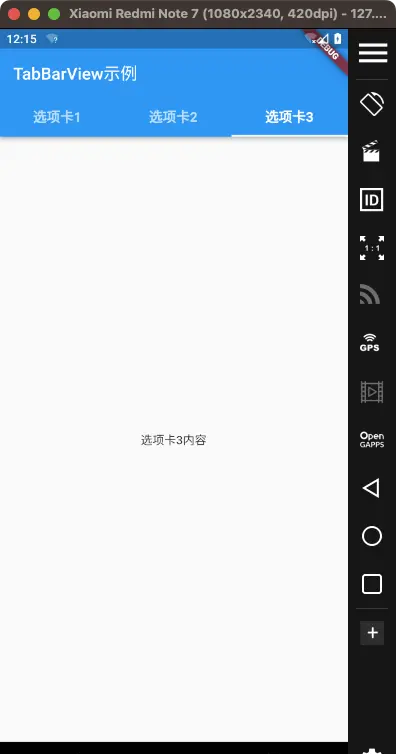
一、TabBarView 经典开打
TabBarView,用于创建具有选项卡导航的可滚动视图。
上代码。
import 'package:flutter/material.dart';

void main() {
  runApp(MyApp());
}

class MyApp extends StatelessWidget {
  @override
  Widget build(BuildContext context) {
    return MaterialApp(
      home: DefaultTabController(
        length: 3, // 选项卡的数量
        child: Scaffold(
          appBar: AppBar(
            title: Text('TabBarView示例'),
            bottom: TabBar(
              tabs: [
                Tab(text: '选项卡1'),
                Tab(text: '选项卡2'),
                Tab(text: '选项卡3'),
              ],
            ),
          ),
          body: TabBarView(
            children: [
              // 每个选项卡的内容
              Center(child: Text('选项卡1内容')),
              Center(child: Text('选项卡2内容')),
              Center(child: Text('选项卡3内容')),
            ],
          ),
        ),
      ),
    );
  }
}
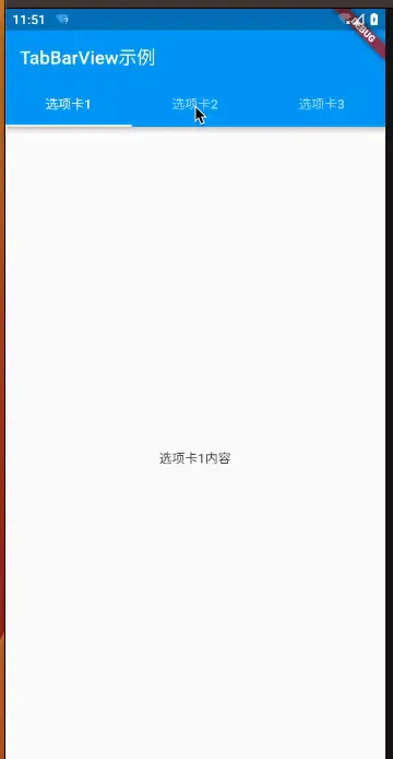
是的,点一点,滑动滑动。常规得不能再常规。
上面这几行代码,我们可以知道。
DefaultTabController的length属性设置为3,表示我们有三个选项卡。- 在
DefaultTabController的child属性中,我们创建了一个Scaffold,这是一个包含应用程序基本布局的小部件。Scaffold包括一个AppBar和一个TabBarView。 AppBar是顶部的应用栏,它包含一个标题(”TabBarView示例”)和一个TabBar小部件。TabBar用于显示选项卡,它的tabs属性包含三个Tab小部件,分别命名为 “选项卡1″,”选项卡2” 和 “选项卡3″。TabBarView是一个小部件,用于显示选项卡内容。它的children属性包含了三个子小部件,每个子小部件都代表一个选项卡的内容。在这个示例中,内容很简单,只是一个居中显示的文本,分别对应 “选项卡1内容”,”选项卡2内容” 和 “选项卡3内容”。
要注意哈,TabBar和TabBarView并不需要一定结合一起
Emm,如果换成原生安卓或者原生iOS,Emm,不说了。
不结合Scaffold可以吗,当然可以
可以使用DefaultTabController、TabBar和TabBarView,并将它们包裹在您自己的自定义布局中。不结合Scaffold;
import 'package:flutter/material.dart';

void main() {
  runApp(MyApp());
}

class MyApp extends StatelessWidget {
  @override
  Widget build(BuildContext context) {
    return MaterialApp(
      home: DefaultTabController(
        length: 3, // 选项卡的数量
        child: MyTabBarView(),
      ),
    );
  }
}

class MyTabBarView extends StatefulWidget {
  @override
  _MyTabBarViewState createState() => _MyTabBarViewState();
}

class _MyTabBarViewState extends State<MyTabBarView> {
  @override
  Widget build(BuildContext context) {
    return Scaffold(
      appBar: AppBar(
        title: Text('TabBarView示例'),
        bottom: TabBar(
          tabs: [
            Tab(
              text: '选项卡1',
            ),
            Tab(
              text: '选项卡2',
            ),
            Tab(
              text: '选项卡3',
            ),
          ],
          labelStyle: TextStyle(
            fontSize: 16,
            fontWeight: FontWeight.bold,
            color: Colors.red,
          ),
        ),
      ),
      body: TabBarView(
        physics: BouncingScrollPhysics(), // 添加弹簧效果
        children: [
          // 每个选项卡的内容
          Center(child: Text('选项卡1内容')),
          Center(child: Text('选项卡2内容')),
          Center(child: Text('选项卡3内容')),
        ],
      ),
    );
  }
}
二、来点自定义
自定义选项卡视图
import 'package:flutter/material.dart';

void main() {
  runApp(MyApp());
}

class MyApp extends StatelessWidget {
  @override
  Widget build(BuildContext context) {
    return MaterialApp(
      home: DefaultTabController(
        length: 3, // 选项卡的数量
        child: Scaffold(
          appBar: AppBar(
            title: Text('TabBarView示例'),
            bottom: TabBar(
              tabs: [
                Tab(
                  text: '选项卡1',
                  icon: Icon(Icons.home), // 添加图标
                ),
                Tab(
                  text: '选项卡2',
                  icon: Icon(Icons.business), // 添加不同图标
                ),
                Tab(
                  text: '选项卡3',
                  icon: Icon(Icons.school), // 添加不同图标
                ),
              ],
              labelStyle: TextStyle(
                fontSize: 16,
                fontWeight: FontWeight.bold,
                color: Colors.red,
              ),
            ),
          ),
          body: TabBarView(
            children: [
              // 每个选项卡的内容
              Center(child: Text('选项卡1内容')),
              Center(child: Text('选项卡2内容')),
              Center(child: Text('选项卡3内容')),
            ],
          ),
        ),
      ),
    );
  }
}
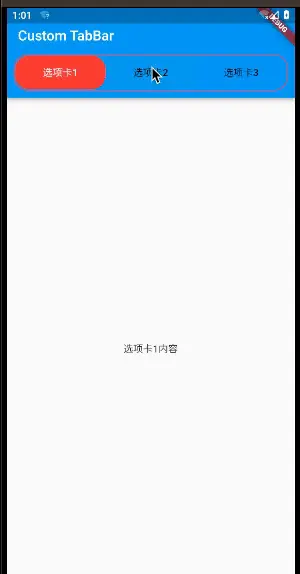
看图
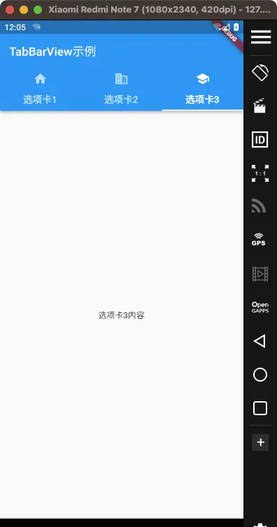
是的,看起来还是简单,但是还可以更多自定义。
tabBar在底部,tabBarView在上方,可以吗,可以
import 'package:flutter/material.dart';

void main() {
  runApp(MyApp());
}

class MyApp extends StatelessWidget {
  @override
  Widget build(BuildContext context) {
    return MaterialApp(
      home: DefaultTabController(
        length: 3,
        child: Scaffold(
          body: Column(
            children: [
              Expanded(
                child: TabBarView(
                  children: [
                    Center(child: Text('选项卡1内容')),
                    Center(child: Text('选项卡2内容')),
                    Center(child: Text('选项卡3内容')),
                  ],
                ),
              ),
              Container(
                color: Colors.blue, // 设置TabBar的背景颜色
                child: TabBar(
                  tabs: [
                    Tab(
                      text: '选项卡1',
                      icon: Icon(Icons.home),
                    ),
                    Tab(
                      text: '选项卡2',
                      icon: Icon(Icons.business),
                    ),
                    Tab(
                      text: '选项卡3',
                      icon: Icon(Icons.school),
                    ),
                  ],
                ),
              ),
            ],
          ),
        ),
      ),
    );
  }
}
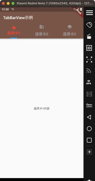
自定义选项卡的背景颜色
- 字体大小、颜色、粗细等
- 自定义选项卡的颜色
- 自定义tab的图标和文本的距离
- 自定义选项卡指示器的背景颜色
- 自定义整个TabBar的颜色
import 'package:flutter/material.dart';

void main() {
  runApp(MyApp());
}

class MyApp extends StatelessWidget {
  @override
  Widget build(BuildContext context) {
    return MaterialApp(
      home: DefaultTabController(
        length: 3, // 选项卡的数量
        child: Scaffold(
          appBar: AppBar(
            backgroundColor: Colors.brown, // 设置AppBar的背景颜色为棕色
            title: Text('TabBarView示例'),
            bottom: TabBar(
              tabs: [
                Tab(
                  text: '选项卡1',
                  icon: Icon(Icons.home), // 添加图标
                  // 特殊设置一下
                  iconMargin: EdgeInsets.only(bottom: 0.0), // 图标与文本之间的距离
                ),
                Tab(
                  text: '选项卡2',
                  icon: Icon(Icons.business), // 添加不同图标
                ),
                Tab(
                  text: '选项卡3',
                  icon: Icon(Icons.school), // 添加不同图标
                ),
              ],


              // 字体大小、颜色、粗细等
              labelStyle: TextStyle(
                fontSize: 18, // 自定义字体大小
                fontWeight: FontWeight.bold, // 字体粗细
                color: Colors.blue, // 文本颜色
              ),

              // 自定义选项卡的颜色
              labelColor: Colors.red, // 选中状态下的文本颜色
              unselectedLabelColor: Colors.grey, // 未选中状态下的文本颜色

              // 自定义选项卡指示器的背景颜色
              indicatorColor: Colors.blue, // 选中状态下的指示器颜色
              indicatorWeight: 4.0, // 选中状态下的指示器厚度
              indicatorSize: TabBarIndicatorSize.label, // 指示器大小计算方式  tab、label两种方式
              indicatorPadding: EdgeInsets.symmetric(horizontal: 16.0), // 指示器内边距


            ),
          ),
          body: TabBarView(
            children: [
              // 每个选项卡的内容
              Center(child: Text('选项卡1内容')),
              Center(child: Text('选项卡2内容')),
              Center(child: Text('选项卡3内容')),
            ],
          ),
        ),
      ),
    );
  }
}
但是,不够,远远不够。
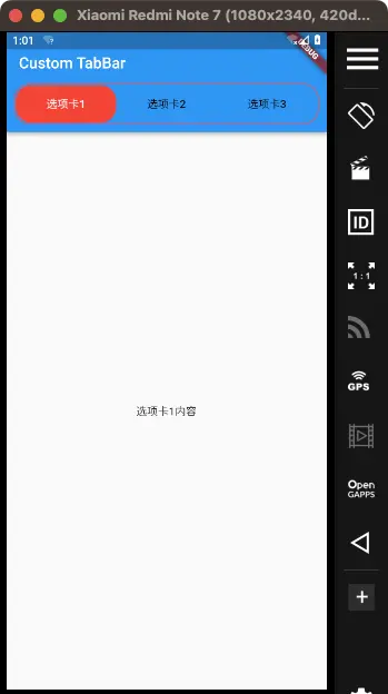
三、稍微高级一点的自定义
tabBar自定义。圆角啊,线包裹啊
PreferredSize 走一个
import 'package:flutter/material.dart';

void main() => runApp(MyApp());

class MyApp extends StatelessWidget {
  @override
  Widget build(BuildContext context) {
    return MaterialApp(
      home: MyHomePage(),
    );
  }
}

class MyHomePage extends StatefulWidget {
  @override
  _MyHomePageState createState() => _MyHomePageState();
}

class _MyHomePageState extends State<MyHomePage> with SingleTickerProviderStateMixin {
  TabController? _tabController;

  @override
  void initState() {
    super.initState();
    _tabController = TabController(length: 3, vsync: this);
  }

  @override
  void dispose() {
    _tabController?.dispose();
    super.dispose();
  }

  @override
  Widget build(BuildContext context) {
    return Scaffold(
      appBar: AppBar(
        title: Text('Custom TabBar'),
        bottom: PreferredSize(
          preferredSize: Size.fromHeight(50.0),
          child: Container(
            decoration: BoxDecoration(
              borderRadius: BorderRadius.circular(20),
              border: Border.all(color: Colors.red),
            ),
            margin: EdgeInsets.all(10),
            padding: EdgeInsets.all(1),
            child: TabBar(
              controller: _tabController,
              indicator: BoxDecoration(
                borderRadius: BorderRadius.circular(20),
                color: Colors.red,
              ),
              unselectedLabelColor: Colors.black,
              labelColor: Colors.white,
              tabs: [
                Tab(text: '选项卡1'),
                Tab(text: '选项卡2'),
                Tab(text: '选项卡3'),
              ],
            ),
          ),
        ),
      ),
      body: TabBarView(
        controller: _tabController,
        children: [
          Center(child: Text('选项卡1内容')),
          Center(child: Text('选项卡2内容')),
          Center(child: Text('选项卡3内容')),
        ],
      ),
    );
  }
}
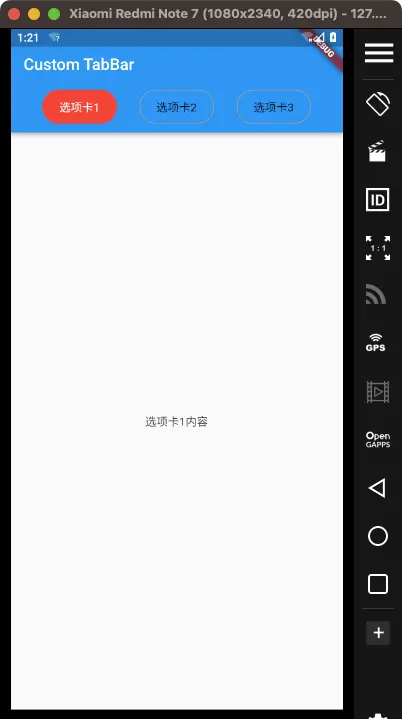
核心,就是 PreferredSize
这不就是以前原生那些看起来很复杂的效果吗
只能说,Flutter,优秀。
但是你知道,不够,这远远不够。
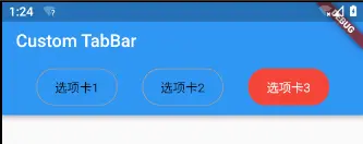
用Row代替Tabvar,TabController走一个
要使用Row来实现类似TabBar的效果,并且不使用PreferredSize。
可以自定义一个Row来放置的选项卡,并使用TabController来控制TabBarView。
import 'package:flutter/material.dart';

void main() => runApp(MyApp());

class MyApp extends StatelessWidget {
  @override
  Widget build(BuildContext context) {
    return MaterialApp(
      home: MyHomePage(),
    );
  }
}

class MyHomePage extends StatefulWidget {
  @override
  _MyHomePageState createState() => _MyHomePageState();
}

class _MyHomePageState extends State<MyHomePage> with SingleTickerProviderStateMixin {
  late TabController _tabController;

  @override
  void initState() {
    super.initState();
    _tabController = TabController(length: 3, vsync: this);
  }

  @override
  void dispose() {
    _tabController.dispose();
    super.dispose();
  }

  @override
  Widget build(BuildContext context) {
    return Scaffold(
      appBar: AppBar(
        title: Text('Custom TabBar'),
        bottom: AppBarBottom(tabController: _tabController),
      ),
      body: TabBarView(
        controller: _tabController,
        children: [
          Center(child: Text('选项卡1内容')),
          Center(child: Text('选项卡2内容')),
          Center(child: Text('选项卡3内容')),
        ],
      ),
    );
  }
}

class AppBarBottom extends StatefulWidget implements PreferredSizeWidget {
  final TabController tabController;

  AppBarBottom({required this.tabController});

  @override
  _AppBarBottomState createState() => _AppBarBottomState();

  @override
  Size get preferredSize => Size.fromHeight(50.0);
}

class _AppBarBottomState extends State<AppBarBottom> {
  @override
  void initState() {
    super.initState();
    widget.tabController.addListener(_setActiveTab);
  }

  void _setActiveTab() {
    if (mounted) {
      setState(() {}); // 触发重建
    }
  }

  @override
  void dispose() {
    widget.tabController.removeListener(_setActiveTab);
    super.dispose();
  }

  @override
  Widget build(BuildContext context) {
    return Container(
      margin: EdgeInsets.all(10),
      padding: EdgeInsets.all(1),
      child: Row(
        mainAxisAlignment: MainAxisAlignment.spaceEvenly,
        children: List<Widget>.generate(3, (int index) {
          bool isSelected = widget.tabController.index == index;
          return GestureDetector(
            onTap: () => widget.tabController.animateTo(index),
            child: Container(
              padding: EdgeInsets.symmetric(vertical: 10, horizontal: 20),
              decoration: BoxDecoration(
                color: isSelected ? Colors.red : Colors.transparent,
                borderRadius: BorderRadius.circular(20),
                border: Border.all(color: isSelected ? Colors.red : Colors.grey),
              ),
              child: Text(
                '选项卡${index + 1}',
                style: TextStyle(
                  color: isSelected ? Colors.white : Colors.black,
                ),
              ),
            ),
          );
        }),
      ),
    );
  }
}
如果看到了这里,还不知道点个赞。那就,过分了呀
请及时点赞。我不要面子的吗???
请及时点赞。我不要面子的吗???
请及时点赞。我不要面子的吗???
请及时点赞。我不要面子的吗???
其实呢,我觉得,完全可以了。
没必要再写了。
举一反三,想要什么效果,自己写吧。
其实可以留言666了。说的就是你,你要知道,写作,很花时间的。
点赞评论,是先富起来的基础条件!
点赞评论,是先富起来的基础条件!!
点赞评论,是先富起来的基础条件!!!
点赞评论,是先富起来的基础条件!!!!
点赞评论,是先富起来的基础条件!!!!!
完事,洗澡。
原文链接:https://juejin.cn/post/7314978984654503963 作者:J船长